Today I wanted to talk to you about a tool that we have been using very actively for more than 4 years now to create all our visual creations for the blog (but not only). For almost 2 years I became familiar with the Canva tool in its free version and in 2018 I decided to switch to Pro by paying a subscription at $119.4 per year. I think I have enough hindsight today to give you a detailed feedback on our use and give you some advice if you hesitate to switch to premium.
Canva: a quick presentation
If you have a blog or a website and you have to create visuals for it I imagine that Canva is not unknown to you. Founded in 2012, this Australian startup has very quickly established itself and today has more than 30 million users worldwide and something like 1200 employees.
Canva’s idea is clearly to offer “ordinary people” a quick and easy solution to create visuals based on models created by professional graphic designers. Graphic design is clearly a profession in its own right and I will never try to tell you that you can suddenly become a “professional graphic designer” thanks to this tool. But let’s just say that it’s a great alternative to make your own little creations on a daily basis!
Before using Canva we used the Gimp software a lot. It was very handy but the big difficulty was often starting from a blank page. It was difficult to find inspiration for new stuff, combinations of colors or fonts that look good together, etc… In short, Canva really made our lives easier!
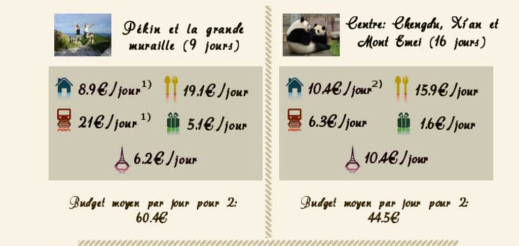
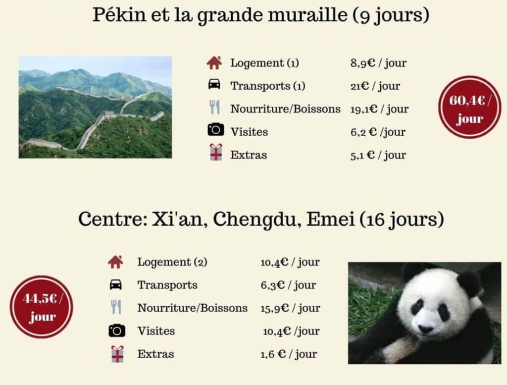
To illustrate my point, here is a small preview of 2 “creations”. One was made in 2013 with Gimp (which must have taken me 45 minutes), then the version redone in 5 minutes with Canva:
Canva: How we use it on an almost daily basis
Before telling you more about the difference between the free and pro versions of Canva, I thought you might be interested in a short presentation of how we use the tool on a daily basis.
Create visuals for social networks and blogs
This first point is clearly the one that pushed us to start with Canva: creating images for the cover of articles for different networks like Facebook, Twitter, Pinterest and Youtube as well as for the blog. Each network has its own “optimal” dimensions and in Canva we have access to a large library of templates for each social network.

Both on novo-monde and novo-media, we no longer publish any article without first creating a small visual with Canva. An article that has a nice cover image and not the first picture of the article (the default choice) will be much more easily shared.
Creation of small simple illustrations for the blog
Once I had started to get familiar with Canva I also took the reflex to use it for our little illustrations on the blog. Here I’m thinking of our travel budget summaries, small montages with maps, etc… Before I used mainly Gimp, but with time Canva became my favorite.


Canva for the layout of ebooks
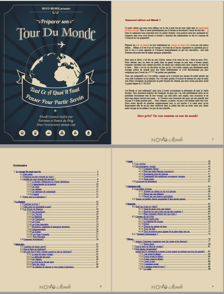
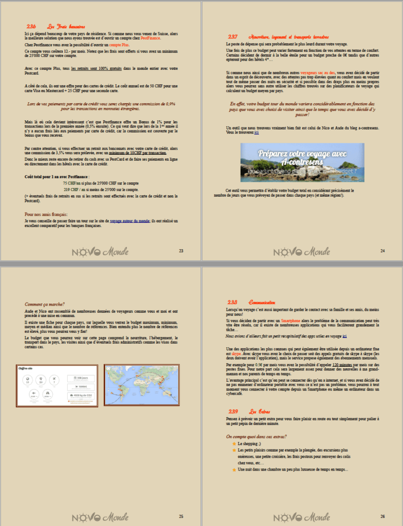
The first time I created an ebook I did it using only Word and Gimp… It was in 2013 and even if I had put all my heart into it, I’ll have to admit that the result was a bit “doubtful” (not to say worse).
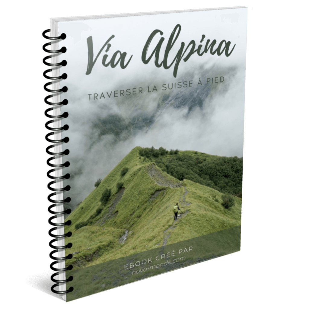
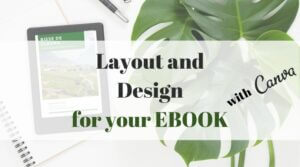
In 2020 we released our ebook on the Via Alpina (also available in English) and this time I used Canva. I don’t think Canva is the “most professional” tool for ebook layout but for someone like me who is clearly not a graphic designer it’s really great! To simplify things and also to avoid it being too long with too many pages in the same document, I simply divided the ebook into chapters to work on them one by one.
Update: We’ve also published a detailed article on how we layout an ebook with Canva. Read the article on ebook design
In the same time, I took the opportunity to update our free ebook on the round-the-world trip and even if the result is clearly not “professional”, Canva allowed me to really improve the visual rendering of the ebook. Judge for yourself…
Version 2013:
And the same pages after redoing the layout with Canva:
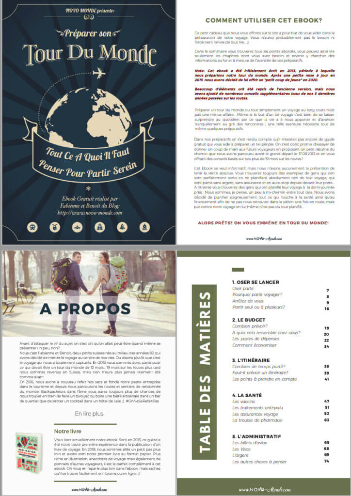
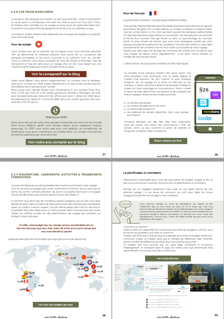
Small note: if you are interested in the ebook it is available for free on our travel blog. 😉
Creation of documents / reports
In our business we regularly prepare reports / documents for projects. (Audience report, media kit, but also pitches for new books for example #spoil 😉 )
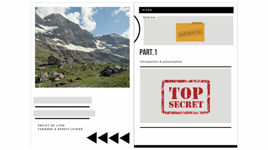
In short, here again Canva is great because it allows not to start from a blank page and to have some inspirations for layouts / colors that go well together.
Fast and visual powerpoint presentations
The last of our “main” uses would probably be for small presentations. There are of course other cases in which we use Canva but let’s say these are the main ones.
When I say presentation, it is mostly at small conferences or workshops that I refer to. For example, we used it to create our conference about SEO which content was detailed in this article.
Free Canva: what can we do?

As I told you in the introduction, I used Canva for free for almost 2 years.
Canva is really one of those software programs that are already very powerful in its free version! If you don’t know the tool yet I recommend you to start with the free version, it will allow you to get familiar with it and especially to see if you miss the extra options that come with the premium 😉
In free mode with Canva you have access to the following things:
- Access to nearly 250’000 visual templates for many different formats (facebook ads, banner, posts insta, stories, twitter and so on)
- Royalty-free illustrations and photos to use to personalize your creations.
- The possibility to save your images in PDF, JPG, PNG (without transparent background option), GIF or MP4.
Why did we switch to Canva Pro?
As you can see above, the free version is already VERY good! For my part, I was fully satisfied when I used Canva only for my Pinterest pins and Facebook visuals. However, when I started to design ebooks and especially to make more and more visuals for the blog, I started to touch “the limits” of the free version. If I decided to switch to Pro it’s for several reasons:
- Have access to more visual elements that were in “Pro” only (drawings, royalty-free photos, more theme templates).
- Be able to automatically resize and create similar visuals in a different size. Example: I create a banner for a facebook post with a style I like and can automatically resize it for Twitter, a post preview or even Pinterest.
- Have the possibility to create thematic folders in which I can quickly find elements I use often (logos, illustrations, photos etc.). In the free version the uploads are displayed in chronological order only and it can take time to search for a previously added image.
- Being able to save my visuals with different resolutions
- Save images with a transparent background (PNG) (very useful for logos and illustrations on the blog) or even in SVG
- Larger storage space (I had reached my limit and my old visuals were being deleted as I went along). In Pro we go from 5Gb to 100Gb.
In terms of pricing, the Canva Pro membership costs $119.4 / year (one-time payment) or $12.95 / month (monthly payment).
Until January 31, 2021, Canva has launched a promotion for all Pro subscriptions. With a subscription you can invite up to 4 people in your “team”. This means that it costs less than 3€ per person per month for the subscription per person. You can share the costs with colleagues, friends or family.
What about you? How do you use Canva? How long have you been using it?
Note: This article contains affiliate links. If you use our link to upgrade to a Pro account we will get a small commission. 🙂 We have been using Canva for 4 years (2 years in pro) and pay our subscription to this service. Thank you very much for your support!
Pin it
