In 2013 we released our very first ebook “How to prepare your round the world trip” and at that time we had opted for Word to realize the layout. I might as well explain to you that on many aspects the rendering was quite “hazardous” (you will find screenshots of this old version in this article dedicated to Canva).
Starting in 2016-2017 we started using Canva in our daily life for creating visuals for social media.
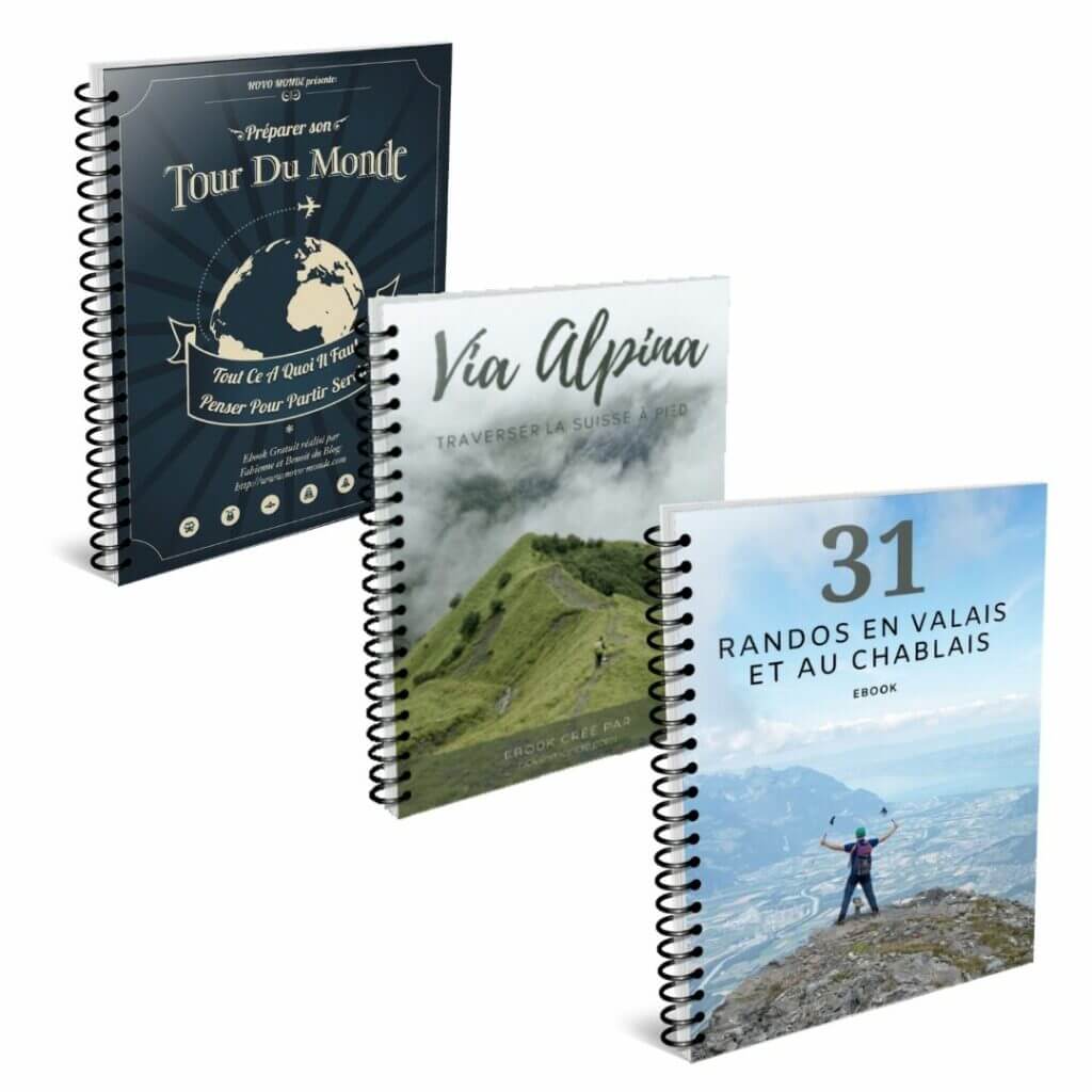
When I decided to create new ebooks (Via Alpina & 31 randos dans le Chablais (french only for the last one)) I naturally turned to this tool (and I took the opportunity to update our round the world trip ebook at the same time) 😉
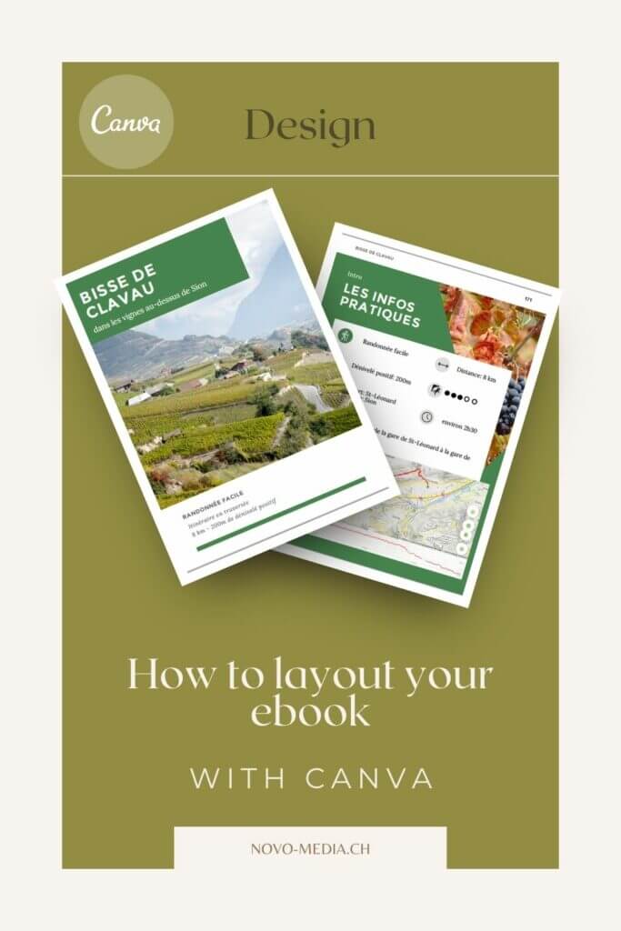
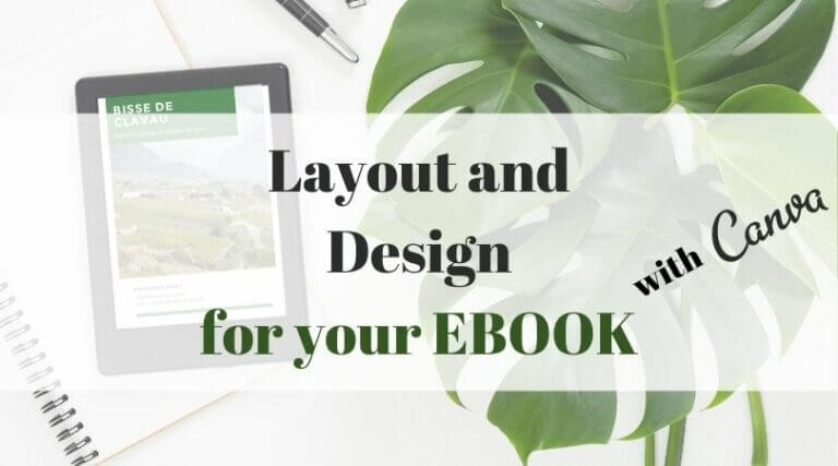
Following a lot of questions from readers about our ebook layout process, I thought it was time to present you a little bit of my way of doing things with Canva and the points I try to pay attention to as well as give you some advice from my experiences. You’ll find an illustrated summary at the end of the article, but before that, here is the table of contents to orient you:
- Ebook layout: what are the options?
- Why did I decide to use Canva for the layout of our ebooks?
- The choice of the format of the ebook
- Define your visual identity
- My personal tips for formatting your ebook with Canva
- Create the cover of your ebook and the table of contents
- Finalize your ebook using Adobe Acrobat
- My ebook creation process in a nutshell:
Ebook layout: what are the options?
When it comes to ebook layout there are a multitude of options! Many people simply decide to go with Word or Page (I had actually made the same choice when we created our first ebook in 2013).
For an ebook containing mostly text, this ultra simple and intuitive solution can, in my opinion, clearly “do the job”. Nevertheless, the rendering will clearly be very classical and will probably lack originality.
From the moment you want to further customize your ebook there are 3 main options:
- Hire a professional graphic designer. If you are not good at design or simply if you don’t have the time, this solution is a good option. The result will be generally qualitative but obviously the budget will be relatively consequent too. To find freelance graphic designers the best platforms are 99designs or Fiverr.
- Use a design software. The most famous and used is without doubt Adobe In Design. With this method you will need a certain “sense of design” and ideally a well established knowledge of the Adobe suite (everything can be learned of course, but it can take a long time).
- Use online design tools like Canva or Crello. In the last few years, web design applications have been created and I must admit that they make it easier for anyone who wants to start customizing their visuals but doesn’t want to have a lot of knowledge.
Why did I decide to use Canva for the layout of our ebooks?
In fact, to make my choice I went by elimination. The first option was not realistic economically speaking while Adobe Indesign would have required too much time to get used to the software and master it. We talked about it in our article on Canva, but this tool we already use it for many years (in premium since 2018). With time I have acquired a good mastery of the different tools and it is simply a software that I enjoy using.
By the way, I recently tested Crello, an application often described as “Canva’s little twin“. And very clearly, this tool seems to me also very suitable for the layout of an ebook! It is really very similar to Canva and can be a great alternative. Crello is a bit cheaper ($96 per year vs $112 for Canva) and the handling is very similar.
I for one decided to stick with Canva Premium because they offer more templates and especially infinitely more stock images available in the paid version.
The choice of the format of the ebook
In this part what I mean by “format” is indeed the size of the ebook (A4, A5, landscape, portrait). By making a very visual ebook, we made the choice to create it in PDF format and not ePub. If you want to read more about the difference between the types of file format, we invite you to read our guide on how to create an ebook.
In fact, the most logical way to define the format is to start by asking yourself on what type of device or medium people will read your ebook. Computer? Tablet? Mobile? Do you think some people will opt to print the ebook?
Landscape format can be a very nice option from a design point of view, but I must admit that this format puts me off a bit as soon as we go on mobile. The same goes for double-page spreads: it can sometimes be tempting to create designs that spread over 2 pages. The rendering can be excellent on a computer, but it will probably be less nice on a tablet or mobile.
In short, for the format of the ebook I really advise you to stick to the classic A4 (for my part always in portrait format).
Define your visual identity
If you already have a website, it is likely that you have already defined a visual identity at some point… When you create an ebook, you can obviously use these elements if you want it to be 100% in line with the rest of your content. Personally, I like the idea of having a little freedom to create a universe that goes with the theme of the ebook and I usually decide to create a new “mini visual identity” for each project.
What exactly do we mean by visual identity? In fact it is to define in advance a number of factors that will allow to have a homogeneous rendering and especially a pleasant ebook to read. We find here elements such as colors, fonts, the shape of certain recurring elements, the style of illustrations and photos.
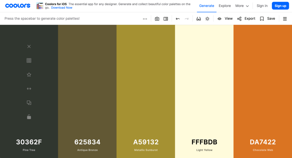
Define a color palette for your ebook
If you have arrived at this article and are looking for advice on the layout and design of an ebook, chances are you are not a trained graphic designer 😉 I’m far from being an expert in visual creation and probably not in a position to give you specific advice on the subject. But if like me, you are simply looking to create a harmonious and sober result, there is one point you can’t cut: The choice and the delimitation of the colors of your ebook.
When I designed my first ebook, I had a very “random” approach. I took each page (or let’s say each chapter) individually and used colors that I thought were “pretty” without asking myself more questions. The result? A colorful ebook, but one that lacked harmony and unity.
My advice? Define a color palette from the beginning that goes well together and stick to it! Whether it’s for titles, infoboxes, highlights, logos or illustrations, sticking to a base of 5-8 colors will make any ebook look much better.
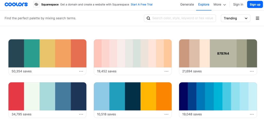
If like me you’re already struggling to match your couch to your curtains and the color codes sound like Chinese, there are some online tools that are VERY handy to help you.
I personally have a special liking for the site coolors.co. Totally free, it allows you to easily find color palettes that go well together. You can either use palettes created by others (Explore tab) or generate your own (Generate tab).
Making a font choice
This choice may seem trivial to some, but believe me, on an entire ebook the font is really important. The choice will greatly influence the readability and even if it may seem tempting to go for an “original” font, it is still better to make sure that the rendering remains sober and pleasant to read.
For my part, I always choose to combine at most 2 fonts (one for the body of the text and possibly another for some titles or infoboxes). To make my choice, I usually look on Canva. In the “default” texts they have hundreds of font combinations that look good together. I confess, I trust the graphic designers at Canva more than my instinct 😉
If you are in a more adventurous mood or simply have a clear idea of what you want, I recommend the excellent site DaFonts. Many fonts are open access, although for commercial use (and if you plan to make an ebook this will be the case) it is often required to make a donation or purchase a license.
Oh and important detail: do not try to maximize the amount of text per page! An ebook should be easily readable and airy. For the font, don’t hesitate to choose a size that is comfortable to read. For my part, I generally opt for font sizes between 12 and 14.
Favour a white background for your ebook
This point is not to be taken literally as there are probably valid exceptions, but let’s say it’s a good general rule.
A colored background can be “nice” on a page or two, but on an ebook of several tens of pages (or even more), it quickly becomes very heavy visually speaking. Moreover, a point that I had not necessarily anticipated, but many of our readers have told us that they had printed our ebook on the preparations of a world tour… More than 100 pages printed with a pale yellow background… hmmm we have probably largely contributed to empty the ink cartridges of our readers. #oups
Photos and illustrations for an ebook
Here too it is important to think beforehand about the universe we want to create. By having a more global vision, it will help to choose the best photos and illustrations to enrich our ebook.
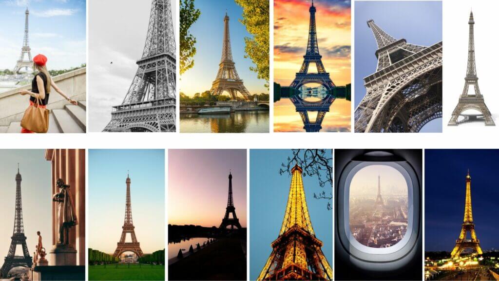
Let’s take an example: Let’s say I’m writing an ebook about Paris… I have a number of personal photos but I know in advance that I will have to use some stock images to complete my collection. Here, it is important to define what are the “specificities” of my existing images (whether it is the colors, the type of framing or more generally the editing).
On Canva there is, for example, an almost infinite number of photos of the Eiffel Tower. But clearly, even if I decide I want a “vertical” photo, there are still plenty of photos to choose from:
And it’s exactly the same for the illustrations! The stock of illustrations on Canva is huge and there are creations of artists with very different styles and universes. Some illustrations will be very realistic, others minimalist, in a comic book style, etc… Here too, it is better to choose a type of illustration and then try to stick to it throughout your ebook.
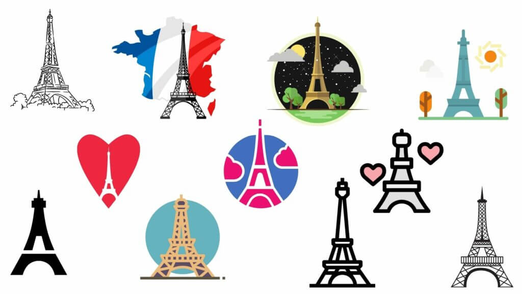
Let’s take another example: let’s say that throughout my pages I talk about different monuments and French culture… For each theme I put an illustration.
Option 1: I opt for a “drawn” style
Option 2: I take the first suggestion that comes up (yes, it’s the same monument as on the picture above)
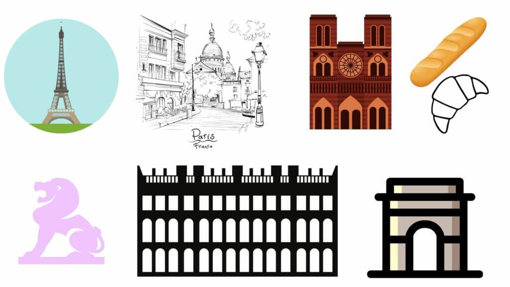
You either like or dislike the design style, but you have to admit that having a form of unity in your choices makes the whole thing more coherent right away.
My personal tips for formatting your ebook with Canva
To finish on the ebook layout part, here are some additional tips from my experience with Canva:
- Break your ebook into chapters: Canva is a web-based program and I’ve noticed that when you have more than 10-15 pages on a single project Canva can start to get a little slow. I divide my ebook into chapters of 4-10 pages and then open a new project for each chapter.
- To save time on layout and basic styles I usually start with a first chapter that I duplicate. I then go back to my copy to create the new chapter by replacing the texts/images and I modify the layout to create variation while keeping a similar basic structure.
- If you choose a royalty-free font in Canva and not one you have acquired the rights to, make sure you can find it for download so you can install it on your computer. Having the same font available in Adobe Acrobat afterwards will make it much easier for you to make last minute corrections/additions.
- Even if you have exported the PDF never create a new chapter by editing an old one!!! Always make a copy and keep the individual chapters (yes I made this mistake a few times and bitterly regretted it when I wanted to change things afterwards)
- Give your pages some space! I really recommend not to start with a too busy layout. In traditional publishing we often try to minimize the number of pages (printing issue) but in an ebook we are much less limited. Illustrated pages with a sufficiently large and readable font make your product more attractive right away!
- Canva Pro allows you to create folders and for ebook writing I find this feature VERY useful! Before starting the actual layout I usually create folders for each chapter / theme and I put my photos, stock photos from Canva as well as illustrations that fit my graphic design and that I think I will use. See Canva Pro
- When I work in Canva I tend not to pay attention to the resolution of the images I add (I put the best resolution) and I export in the maximum size. The files are very “big” but this problem is easily corrected with Adobe Acrobat once the final document is done.
- In Canva it is possible to add links directly to your documents (external links). Personally, I prefer not to put the links and then add them via Adobe Acrobat. The reason? Sometimes I like to put a button, sometimes I like to underline the link, put the text in bold, etc… Canva does not allow you to customize the style of the link and it will automatically be underlined.
Create the cover of your ebook and the table of contents
Once all the chapters have been created and exported in PDF format, it is time to move on to the table of contents and the cover.
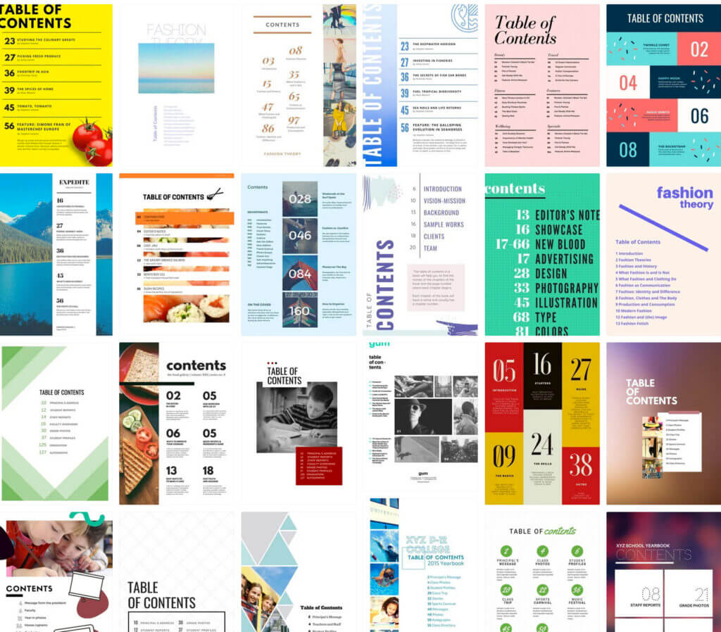
It is, in absolute terms, possible to create tables of contents automatically, but frankly that would be a shame. In Canva you can find several hundreds of very nice templates for tables of contents. From these it is easy to integrate your color codes (you can of course start from a blank page if you are comfortable with Canva).
But be careful, since in Canva internal links are not possible and especially since we made all our chapters individually, the best is to simply create the visual aspect of the table of contents and export it in PDF format. We will take care of the links once in Adobe Acrobat.
As for the cover page, it is also possible to be inspired by the templates proposed by Canva. Here, everything will depend on the theme of your ebook and the general style you chose to use throughout the pages. But if I can give you some tips for the cover page I would say:
- Simple and Effective! As with classic books, the cover is the first thing the reader will see and he/she should immediately understand what the ebook is about
- Limit the text. Too much text on a cover makes you dizzy in my opinion… You should see the title and possibly a subtitle, the author’s name and… Basta!
- Feel free to create several versions and let your imagination run wild. Some of them will look miserable but may lead you to something else.
My “trials” for our last ebook looked like this for example:


- Think thumbnail! It is likely that for the promotion of your ebook you will use thumbnails of your cover. The more it is loaded with small text, the less readable it will be.
A small example: for our last ebook “31 randonnées en Valais et dans le Chablais” I had a soft spot for the cover with the 3 pictures and the text. I found it nice and visually pleasing. The problem? Once put in miniature, you simply couldn’t see anything. Admit that the one chosen in the end is “clearer” when you see the miniature book in one of our articles?
Finalize your ebook using Adobe Acrobat
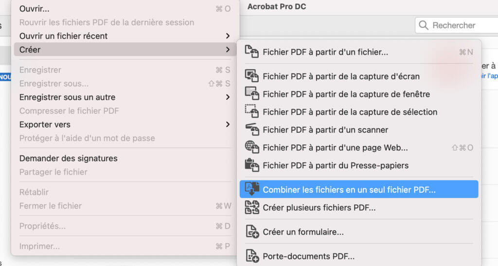
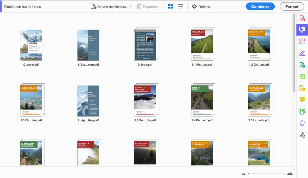
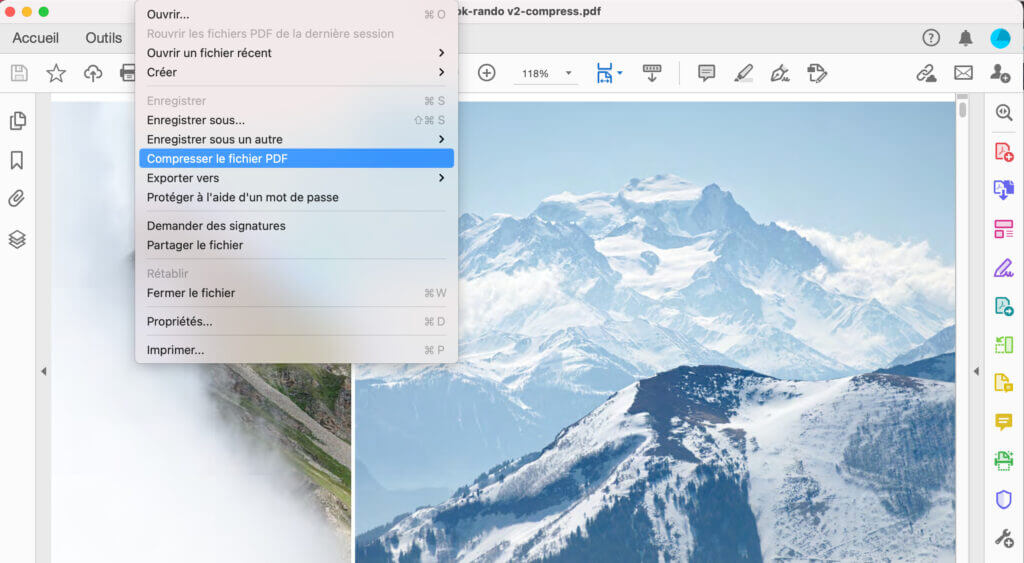
Once we have all the chapters in PDF format as well as the table of contents and the cover, there is still one important step left: The merging, the addition of the links and the corrections. For this step I always use Adobe Acrobat.
At this stage, the first thing to do is to create a single PDF file that combines all the files we have. The “Combine files” tab is perfect for this: we choose all our files and in the editor we can easily change the order of the chapters.
Once the combined file has been created, we go to “Edit” mode.
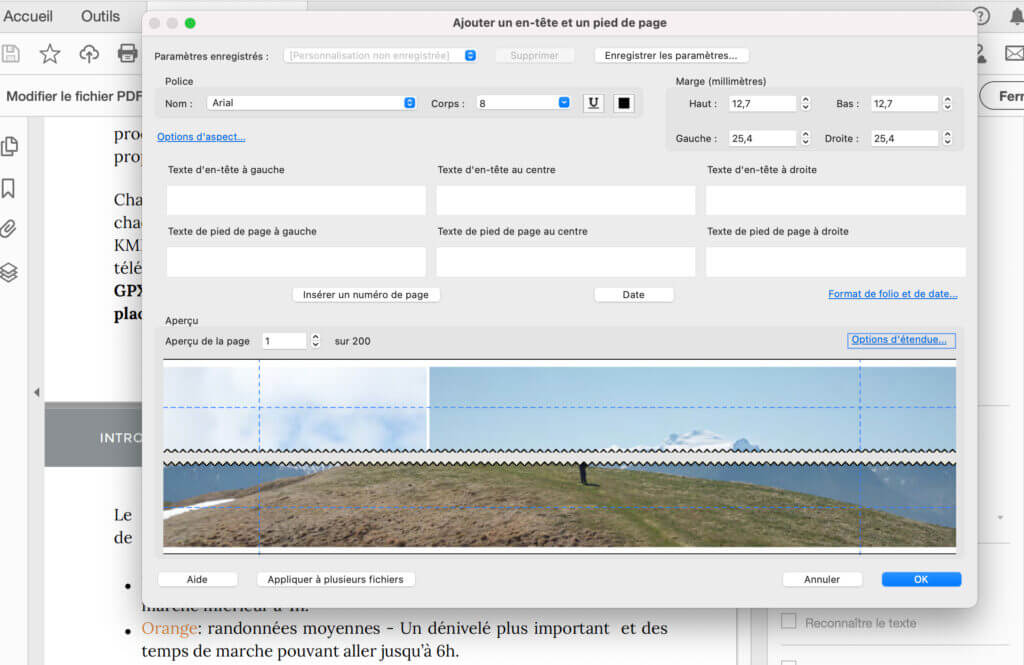
For my part, I always start by automatically adding the page numbers (if you do it in Canva, it removes all flexibility to rearrange the order of the chapters).
Important: Before you start editing, make sure you have the font used in Canva installed on your computer so you can find it in Adobe. For page numbers as well as for last minute corrections, it is essential to use the same font as the one used in Canva.
In the editor you can easily choose the position of your page numbers (top, bottom, center, right, left) and depending on your design you can move them using the margin settings.
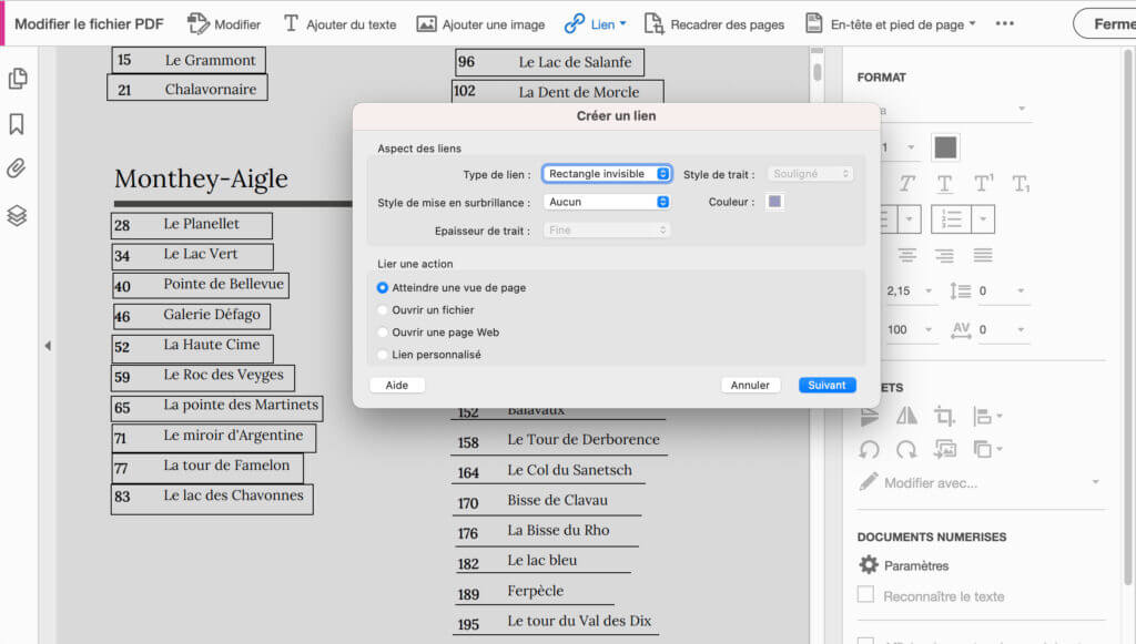
Once the page numbers are placed, I then move on to the links. With Adobe you can easily insert external links but also internal links to the document by choosing the desired page view (very useful to link all the chapters of the table of contents for example).
Once all the links are in place and the first small corrections have been made (image alignments, correction of typos in the text, etc.) I usually choose to export my “final” version once.
This “final” version is a first file that I will read, reread and have reread in order to find the last small errors that are hidden there but also try to open it on various different devices (mobile, computer, tablet) to make sure that both the font and the visual elements are well visible and readable.
Once you are happy with the result, all you have to do is export the file in a compressed version (this is not mandatory for relatively small files, but if like us you include a lot of photos this is highly recommended). To give you an idea of the compression, our last ebook was about 1,2 GB in “full” version and after compression it was reduced to 64 MB while keeping a sufficient image quality.
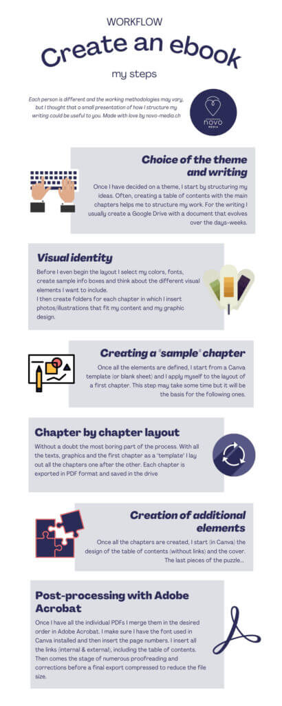
My ebook creation process in a nutshell:
To finish this article, here is a small visual representation of my different steps. If you have already created an ebook and you have remarks, additional tips, etc. do not hesitate to leave us a small comment below.
Note: This article contains affiliate links to sites that we recommend. By using our links you do not pay anything extra, but we will get a small commission. All the software we use and recommend to you is software for which we also pay our license fee.
Pin it