
With all the types and sizes of screens that now exist on our smartphones and computers, the topic of image optimization of a website has become quite complicated. In my last article I explained you how you could compress your images to reduce their weight while keeping a beautiful quality (you will also find a detailed comparison and test of the best WP image optimization plugin here). But even if your images have been well compressed, this does not mean that the browser displays the right image according to the type and size of the screen (understand that it is possible that the browser loads an image of 1500X1000 and actually displays it in 900X600… this is not optimal because the loaded image is much heavier than it should be).
In this article I will focus on the case of images in the WordPress CMS. But know that most of the things I will talk about below are valid for any website that displays different images depending on the size and type of screen (which is really important in 2019 😉 ).
What happens when you upload an image in the WordPress admin
When you add an image to the Media Library, WordPress will automatically create multiple copies of that image with different dimensions. Besides, you may have noticed that when you insert a media in an article, you can choose by default between 4 image sizes:
- Full size : the original dimensions of the image you uploaded
- Large : the default image has a maximum width of 1024px or a maximum height of 1024px (this can be changed in the media settings)
- Medium : the default image has a maximum width of 300px or a maximum height of 300px
- Thumbnail : the default image has a maximum width of 150px and a maximum height of 150px
Also note that since wordpress 4.4, a 5th image size between large and medium is automatically created with a width of 768px (no max height). So you see that by default, wordpress already creates 5 images on your server each time you upload media to your library.
Without going into details, you should also know that wordpress theme developers also have the ability to add different image sizes that may be necessary for a specific design. So it is quite possible that you have more than 5 images created each time (for example, for the theme I created for our novo-monde travel blog, I added an extra size so that each time I put an image in the library, it is actually 6 images that are created).
Since version 5.3 of WordPress it is no longer 5 images but 8 that are created each time you add an image to your media library. For more details, I wrote a complete article about this update
But why does wordpress create copies of images of different sizes?
Responsive images: Different images depending on the size and type of screen
Images in WordPress before version 4.4
Basically, wordpress created these different image sizes so that you could simply choose whether you wanted to insert a larger or smaller image into your web pages. When you added media to your page, wordpresse simply added an html image tag as follows:
<img src="http://acoolblog.com/wp/wp-content/uploads/2018/03/large-size-img-1024x700.jpg" alt="large size image alt">
or something like that :
<img src="http://acoolblog.com/wp/wp-content/uploads/2018/03/medium-size-img-300x200.jpg" alt="medium size image alt">
The concrete case of a responsive website
But with the arrival of responsive websites (which adapt to screen size) and the emergence of mobile phones, this way of inserting images was no longer appropriate. A smarter way to insert images had to be found so that the browser could choose the most appropriate copy of the image for the size and type of screen.
To better represent all this, let’s take the classic example of an image aligned on the left on a site with a design that adapts to the size of the screens (responsive) as on our own blog. Here is how an image aligned on the left behaves on novo-monde:
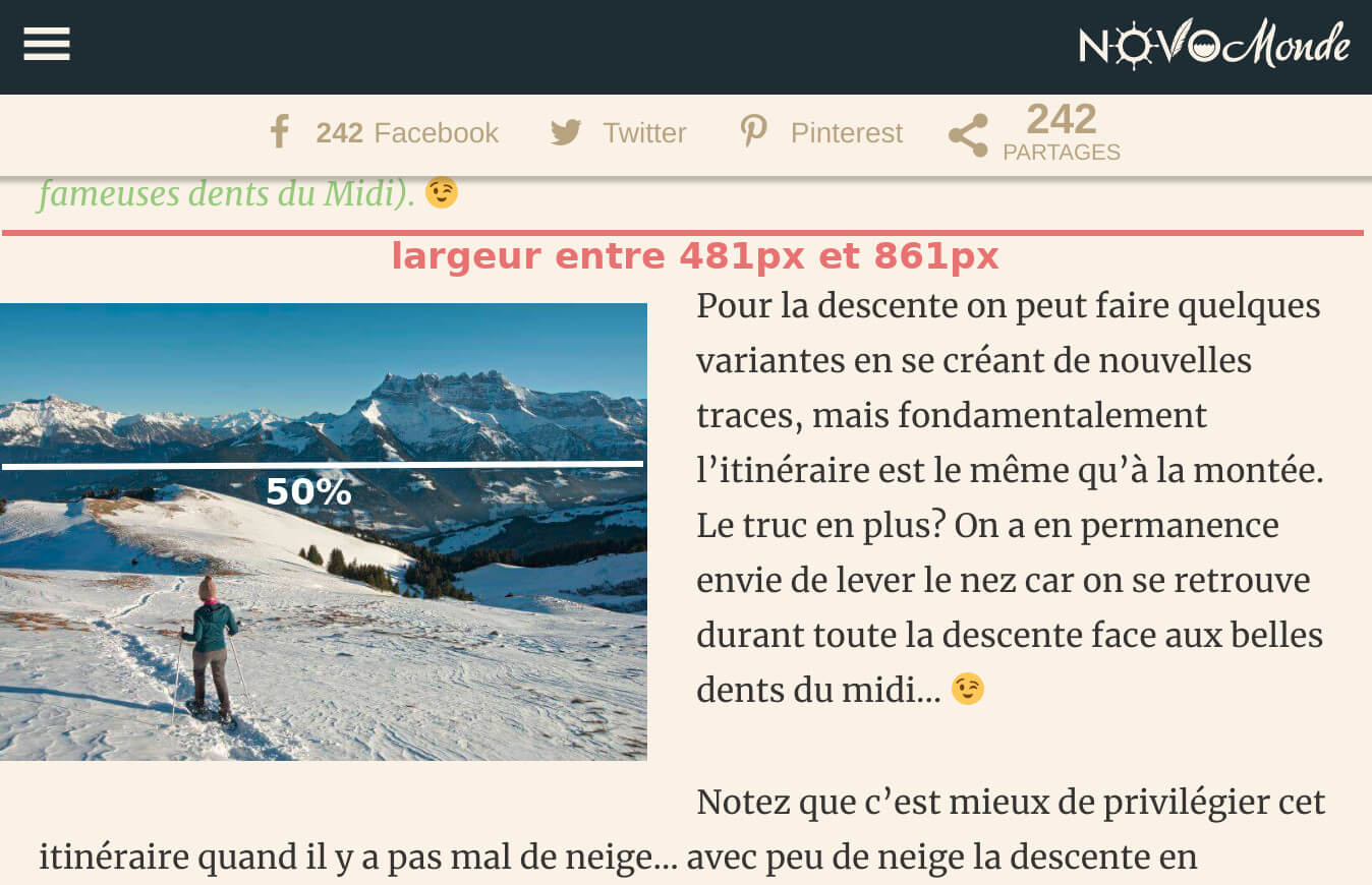
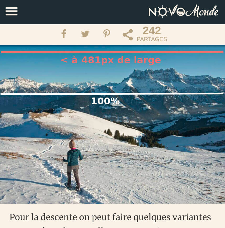
You can see that there are 3 scenarios and that depending on the width of the screen, the image behaves differently:
- if the width is greater than 861px, the image is 363px wide
- if the width is between 481px and 861px, the image is 50% of the width
- if the width is less than 481px, the image is 100% of the width
This kind of CSS rule is called “media queries”and is the basis of any good adaptive website.
It’s all very nice but the idea now is to tell the browser to choose among all the different sizes available to us (6 in the case of our blog novo-monde), the image that has the most suitable dimensions according to the size and type of screen… So understand that if you look at the site on a mobile phone, you don’t want it to load the image in its original size 🙂 because the image would be much too heavy for the quality at which it would be displayed (and it would not be good for your loading speed and SEO)
The arrival of srcset and sizes attributes
To solve this problem, the developers introduced 2 new attributes to the image tag which are srcset and sizes. These attributes were introduced in wordpress from version 4.4 and now when you add an image to an article, the image tag is a little more complicated. So here’s what I get when I insert a left-aligned image on our blog:
read my post about wp 5.3<img
class="alignleft"
src="https://acoolblog.com/wp/wp-content/uploads/2018/03/large-1024x723.jpg"
alt="image alt"
srcset="http://acoolblog.com/wp/wp-content/uploads/2018/03/grand-1024x723.jpg 1024w,
    http://acoolblog.com/wp/wp-content/uploads/2018/03/average-300x212.jpg 300w,
    http://acoolblog.com/wp/wp-content/uploads/2018/03/average-large-768x542.jpg 768w,
    http://acoolblog.com/wp/wp-content/uploads/2018/03/very-large-1508x1065.jpg 1508w,
    http://acoolblog.com/wp/wp-content/uploads/2018/03/full-size.jpg 3200w"
sizes="(min-width: 861px) 363px,
    (min-width: 481px) 50vw,
    100vw"
>
You can see that the image tag is much larger because both srcset and sizes attributes have been added (they are highlighted in purple). Let’s analyse together what is in these two new attributes:
- srcset : You see that the srcset attribute contains 5 urls of the same image but of different size. In addition, for each url it also contains information on the width of the image. WordPress therefore puts in the srcset attribute all the copies of an image it has at its disposal except the one of the thumbnail size. This information will allow the browser to know which image sizes are available.
- sizes : In the sizes attribute, you may notice that the numbers look strangely similar to the behavior of the left-aligned image I described above. This is because this attribute is there to describe to the browser how the image should behave. If we check at how it works:
(min-width: 861px) 363px: This means that if the width is greater than 861px, the image must be 363px wide.(min-width: 481px) 50vw: If the width is greater than 481px (but less than 861px because of the other line), the image must have a width of 50% of the space at its disposal100vw: In all other cases (roughly if the width is less than 481px), the image must take up 100% of the space at its disposal.
NB: You will notice that the above figures are only here as an example and have been set up specifically for our theme. The rules to define for your own site will depend on your theme and its behavior according to the different screen sizes.
If these two attributes are correctly defined in your theme, the browser will be able to determine which image is the best (among those available in the srcset) based on the width and type of screen. I will give you some examples to help you understand better:
- If you have a Retina screen (pixel density twice as high) 1300px wide, the browser knows that the image must be 363px wide. But since you have a Retina screen, the browser will need a twice as large an image and will therefore choose the medium-large version which is 768px wide.
- Imagine that you have a tablet with a 600px wide non-Retina screen. The browser knows that the image must be 50% wide (i.e. 300px) and will therefore choose the medium version available to it, which is precisely 300px wide.
How do you know if your wordpress theme has responsive images?
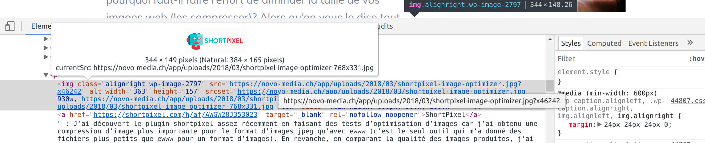
Now that I’ve explained all this to you, I’m sure you’re dying to know if your wordpress theme (or your website in general) has properly integrated adaptive images. If you want to check, you can for example follow these steps:
- Open an article on your site using the Chrome browser (it’s no advertising… just the browser I prefer for this kind of thing)
- Put your cursor on an image, right-click and choose “inspect”
- You should see the img tag of the image in question which should contain both srcset and sizes attributes.
- If you move your cursor over the src attribute, a small window will open telling you which version of the image is used (in the currentSrc)… this is how you can check if it is the correct version of the image that is loaded

If so, it’s already a good start… but that doesn’t mean that the srcset and sizes attributes are correctly set up. In my experience here is how wordpress works by default (i.e. if you install wordpress without any special themes, that’s how it works;) ) :
How does srcset and sizes behave by default in WordPress
Let’s assume that you have put in your media library an image that is 3200px wide and 2138px high (this is the size of the image I had chosen to test). You insert this medium size image in your article, here is the image tag that is created by wordpress (on a fresh wordpress installation with the twentyseventeen theme):
<img
class="size-medium alignleft"
src="https://novo-media.ch/app/uploads/2018/03/DSC08456_2-300x200.jpg"
alt="le alte de mon image"
width="300"
height="200"
srcset="https://novo-media.ch/app/uploads/2018/03/DSC08456_2-300x200.jpg 300w,
    https://novo-media.ch/app/uploads/2018/03/DSC08456_2-768x513.jpg 768w,
    https://novo-media.ch/app/uploads/2018/03/DSC08456_2-1024x684.jpg 1024w"
sizes="(max-width: 300px) 100vw, 300px"
>
If you insert the large size image in an article (525px wide in the twentyseventeen theme), you will get this tag :
<img
class="size-large alignleft"
src="https://novo-media.ch/app/uploads/2018/03/DSC08456_2-1024x684.jpg"
alt="le alte de mon image"
width="525"
height="351"
srcset="https://novo-media.ch/app/uploads/2018/03/DSC08456_2-300x200.jpg 300w,
    https://novo-media.ch/app/uploads/2018/03/DSC08456_2-768x513.jpg 768w,
    https://novo-media.ch/app/uploads/2018/03/DSC08456_2-1024x684.jpg 1024w"
sizes="(max-width: 525px) 100vw, 525px"
>
When I look at the created tags, I notice 2 main things:
- The original image (3200px wide) is not in the srcset attribute. This is because by default, wordpress applies a 1600px limit to prevent themes that were not designed to work with adaptive images from loading huge images. This limit can be removed using this function (which I use on our theme to remove the limit).
- The sizes attribute is very simplistic. It means that if the screen size is larger than the image, the width of the image must not exceed the defined size (300px or 525px). If the screen is smaller than the width of the image, the image must take the full width of the screen. We will say that this rule is well suited for designs that are not too complicated with images that take the full width of the screen up to a certain size. But for more advanced responsive sites, the sizes attribute must be modified so that the most suitable image is loaded in all cases! (if there are developers reading this, you must use this filter to modify the sizes attribute. You can also read this article which gives an excellent example of how to implement this filter).
I will give you that, for the normal user of wordpress, it may sound a bit like gibberish. But just by inspecting your image tag, you can already check if you are not using unnecessarily large (or small) versions of your images… it is already a good start.
But… I’m not a developer and my images are not responsive… what can I do??
Install a wordpress theme with responsive images
So I’ll be honest with you, I have the impression that this wordpress feature is a little ignored by theme developers. I have tried to test demos of many of the most popular themes sold on the web and none of them customize the image sizes attribute. Considering what can be done with these two attributes and that loading images larger than they are displayed slows down the loading time of web pages, I find it very strange and it’s such a pity!
Anyway, if you know of any wordpress themes that use these two attributes to their full potential, I would be happy to add them to the article 😉 (don’t hesitate to give me links in comments)
I have finally found themes that integrate these attributes more or less correctly. You can take a look at the Mai Reach and maiMai Success themes that work with the Genesis framework and customize the srcset and size attributes.
Otherwise I’ve also written a guide about the fastest WordPress themes that might also be of interest to you
Use a specialized CDN for images
There are also specialized CDN services for images that claim to be able to serve images directly to the right dimensions. How does a CDN work for images? Instead of being served from your server, your images are distributed on a server network around the world and are served from the server closest to the user. In theory, since these servers are specialized in image management, they are also supposed to compress images (in this case, the use of a compression plugin becomes redundant) and serve them to the ideal dimensions for display on the browser (but this remains to be verified). Here are some examples of this type of CDN
 Photon : The best known of these services is certainly photon from the Jetpack wordpress plugin. Once activated, your images will automatically be placed on the photon servers and all the urls of your images will be rewritten to redirect to these servers. According to the documentation, the plugin is based on the width and height attributes of your img tags or on the size of the image container (it chooses the smallest of the two) to display images directly resized to the correct size. So even if srcset attributes and sizes are not available on your site, images should be served directly at the right size.
The negative point of photon is that all images are automatically cached without any way to empty it (so to make a modification on an image, it is necessary to create a new one in the library). In addition, if you delete an image from your media library, it will not be deleted from the photon server. And of course, you have to install a huge plugin like jetpack just for photon.
 ExactDN : ExactDN is an option of the plugin ewww image optimizer which works on the same principle as photon. Unlike Photon, ExactDN is not free and requires an API key to work. However, you can clear the cache of your images and delete them using this solution. I haven’t had time to test this solution yet but as soon as I’ll have some, I will give you a feedback. More information about ExactDN here.
- I’ve also seen other plugins like Cloudinary, Sirv… that offer essentially the same kind of services
My opinion on CDNs specialized in images
After looking at some sites that use photon or ExactDN, I get the impression that these services respect the rules defined in the srcset and sizes attributes (maybe I’m wrong but that’s my impression). So for sites that have these attributes implemented (with the default wordpress rules), I don’t think these CDNs will solve the adaptive image problem.
In my opinion, you can use this kind of service if you want your images to be served more quickly to your readers (for example, for Internet users browsing your site from remote areas of your server). But at that moment, you might as well put your whole site on a CDN and not just the images.
there too, I would love to get feedback from people who use these services regularly and who don’t necessarily have the same opinion as me 😉
The solution of the lesser evil for Mr. and Mrs. everyone
I am well aware that I have not yet given a satisfactory answer for all people who do not want (or know) to get their hands in the code to change the srcset and sizes attributes. If this is your case, here is how you should insert the images into your articles:
Always insert your images with the size (available in your theme) closest to the dimensions of the image on the large screen! For example, if you insert a left-aligned image and it is 400px wide on a large screen, choose the available image size that is closest to 400px wide. Same thing if you insert a centered image and it is 1200px wide on large screens, choose the available size closest to these 1200px.
You’re going to tell me, but why is that?
Remember the default wordpress settings for the sizes attribute. If you insert an image aligned on the left with a size of 400px wide, here is the attribute that will be created:
sizes="(max-width: 400px) 100vw, 400px"
This rule means: if the screen width is less than 400px, the image width is equal to the screen width. In all other cases, the width of the image is 400px. This rule will probably be good for mobiles (where images are usually displayed in full screen) and for large screens. It is possible that the behavior on intermediate sizes is not optimal but I think it is a lesser evil!
A plugin for WP galleries that integrates responsive images
It may sound crazy but since I’ve been using WordPress, I’ve only found one gallery plugin that correctly integrates srcset and sizes attributes (and is compatible with WordPress native galleries). This plugin is called Meow gallery and I now use it on all my sites! I was so happy to find this plugin that I even wrote a whole article about it:
the best WP gallery plugin: Meow Gallery
Finally, I know that the subject of image dimensions in wordpress is quite ” unpleasant ” but I think it is important to understand how all this works in order to avoid loading unnecessarily large images and to optimize the loading speed of your site. Otherwise I would say that if you already have the srcset and sizes attributes in your images with their default settings (and you follow my last advice), it’s already a good start.
And above all, if anything is unclear, feel free to leave me your questions in commentary on the article 😉

Excellent article, thank you!
Glad you liked it Michal 🙂
Good write-up Benoit and unfortunately reflects my own experience. I.e. WP themes and theme/page builders heavily neglect properly making use of srscet and sizes and image CDNs are all not as plug and play as they make out to be and require dev for proper responsive image handling.
I have one client with a bespoke WP theme where we’re getting the developers to hand code proper sizes and srcset support into all page templates but short of that approach I am struggling to find good alternatives…
Good to hear about Meow gallery, will keep that in mind for future. Makes sense that it’d be a good option seeing as the plugin developer Jordy is also behind WP Retina 2x.
Let me know if you ever come across any better responsive image handling solutions for WP. Will do the same 🙂
Hi Jonas,
I know it’s so frustrating… I have in the back of my mind the idea to develop a speed focused wp theme that would implement these things nicely (just need to find some time to do it 😉 … hopefully one day). I mean… we should not have to use an image CDN to deliver images at the right size!
It’s also the main reason that prevent me to switch to Gutenberg editor as of now as I did not find a way to customize easily these 2 attributes in blocks (but maybe I did not try hard enough 😉 ). You can check what kind of mess it is on this Gutenberg issue –> https://github.com/WordPress/gutenberg/issues/6177
Ouch, yes, Gutenberg does look like a mess in that regard.
I came across Shortpixel Adaptive Images which looks interesting, but as you so rightly say, it’s again a third-party service to address something we should be able to (more easily) do within WP. And even performance focused themes and theme builders like GeneratePress or Oxygen Builder do not cater to this. Seems odd…
Google announced that ‘page experience’ (which includes page speed) is becoming a Google ranking signal next year, so there’s certainly going to be increased demand for well-rounded, speed focused themes.
Thanks for explaining all this. One problem I have encountered recently is trying to get image size working well with google page speed. My theme uses responsive images and it works well on desktop, but on mobile (because mobile screen resolutions are so high these days) it chooses the largest image size for shop thumbnails, even though in real life that image might be only an inch wide. This resolution is (arguably) unnecessary and causes a hit to the page speed score. I assume some sort of function would be needed to adapt the srcset and sizes tags to serve a lower resolution image on mobile?
Hi Jim,
You’re welcome! You say that your theme implements responsive images but does it customize the sizes attribute? (What’s your sizes attr if I can ask?) If you only have the default WordPress sizes attribute you might well load much bigger images than necessary.
Hello Benoit, thanks for your post.
I have exactly the same problem as Jim. The analysis on Page Speed are terrible for mobile (I never reach 30!!) and for desktop are around 60. One of the bad levels on mobile is the size of pictures on the start page. Doble as big as in desktop, even if the size of the screen is much smaller. I used GeneratePress + Elementor Pro to build the home page.
I have to say that my blog is really new, not even a month old, and I am really concerned about performance for the future ranking of the blog posts.
Thanks in advance for your advice how could I improve the speed regarding image optimization. I don’t use any plugin for gallery, and have through the hosting company an option for image optimization but I think this is more like “tinypng” than treating srcset and sizes tags.
Hi Cris… if I don’t know the url where you have the issue, it’s going to be hard for me to help you 😉
oh, you are right!
www.ondasviajeras.com
Thanks a lot for taking the time to answer!
Hi Cris,
I quickly had a look at your website… well I would say that the biggest issues you have don’t have anything to do with images! you have a lot of complex CSS / JS (probably has smth to do with elementor, the insta widget on the home page), you’re loading a lot of webfonts, fontawesome etc… This is what slows down your website the most in my opinion.
I am having the same issue. I have Astra Theme and it serves a full size image to mobile. Any luck figuring out why this is happening?
Hi Kent,
It’s always easier to share a link where the problem happens if you want us to check it out 😉
Benoit,
It’s happening on this page: https://manabouttools.com/super-simple-concrete-garden-boxes-part-1/
And I think my Medium thumbnail size might be too big.
Thx
Kent
Hi Kent,
I checked your page on it’s mobile version and everything looks fine to me. You have the attributes srcset and sizes implemented and the right image is served depending on the width and resolution of the screen
Hi:
“Always insert your images with the size (available in your theme) closest to the dimensions of the image on the large screen! “
Does this mean that when I resize before uploading a feature image for a blog post, it should be the “exact width”of my websites image WIDTH, as adjusted by each person individually in his customizer on a desktop screen.. ?
Thanks
Hi Howard,
No no it means that when you insert an image in a blog post, you should choose the size (thumbnail, medium, large, full size or whatever size your theme adds as well) that is the closest to the dimensions of the image displayed on the large screen. You don’t actually need to resize the image before upload, WP create all these images with different sizes automatically
I still don’t understand…
How to choose … image on large screen? I inspect image warning on page speed and GT metrix. With inspect elements on chrome.
The home page says , scale image, while the post page may not be flagged.
Sizes are different naturally, for feature image and home page.
Gtmetrix used to give corrected image size with the warning—- not any more!!
Add to that— mobile is DIFFERENT than desktop???
Confused more
Howard
One of the best articles about responsive images , but I think there is need more improvent for responsibe images in general, because on mobile tje pixel demsity is more then 1 , and because of that is loaded larger image. If mobile screen is 300px width but screen dentsity was 2 , loaded image will be 600 px width, which is not good for performance.
Tanks Ivan,
Yeah maybe but I guess this is a task for the people developing browsers. I mean, as long as you have the attributes srcset and sizes properly implemented on your site, the browser know which images are available and what the behaviour is supposed to be. So if they see for exemple that users using mobiles with higher pixel density screens have bad performances, they could easily choose to download smaller images.
I appreciate your opinion and articles, but there is no mention of any kind in the article above about new WP default sizes 2*medium-large, 2*large and scaled… what is the reason for that?
Hi CCore, it’s because I wrote this post before WP 5.3 came out with these new sizes. I actually wrote an entire blog post dedicated to this update here –> https://novo-media.ch/en/wordpress-site/wordpress-5-3-image-handling/ . But everything I say in this blog post is still valid
Images are not properly delivered on mobile devices with a fresh installation of WordPress and 3 simple products. The 3 images are displayed at full resolution (1024px).
Desktop view is working well, though.
There’s clearly something wrong with the latest version of WordPress or with WordPress in general. Happens with any free theme (for instance, twenty twenty-one)
Hi Alejandro,
It would be helpful if you could share an url with the issue that I can check. But I doubt there is any problem with WordPress… If you have srcset et sizes attributes properly set on your website, the browser will pull the appropriate image in function of the screen width and resolution of the device
Good write up. It seems obvious that the media queries approach is much simpler. One image, and laid out based on viewport size. For images that have text on them, this seems to make the most sense as the media queries and the image itself can be designed for readability. This also cuts down on having so many image versions for a given image.
Hi Benoit,
Thank you very much for the great information.
There are 2 logo images that show on all the pages. When I test my website on Lighthouse for the Best Practices it says;
“Image natural dimensions should be proportional to the display size and the pixel ratio to maximize image clarity”
Would you please advise me on how to fix this?
Thank you,
Tony
Hi Tony,
I just tested your website in PSI and I couldn’t see this message… I guess you fixed it already
Hey Benoit,
Awesome article. I would love your help with my site if you are interested. I am a photographer and my mobile site speed is terrible. I am trying to improve it but I don’t know enough to mess around with code…
Cheers, Patrick
Hi Patrick,
Thanks for your interest. Unfortunately we decided to stop doing dev or speed optimization projects for now… As we are only 2 people my wife and I, we want to focus more on our blogs and other projects at least for some time. But if you contact me per email, I can recommend you a friend of mine that is a WP developer that I trust.
Deep and Informative! I found it very much helpful regarding the responsive image issue in WordPress and you touched on some great points others hadn’t considered. Thanks a lot to you for sharing.
Hello Benoit, (and to anyone else that could be reading this post and has ideas)
Just read your article and have tried the Meow Gallery. Seems okay. I have been using Simply Gallery as it provided what I needed. But I am not a tech guy so it load and go and cross the fingers that it will work.
My theme is KAVA and it too seems to work ok. Simple website to mostly display photos of cars.
www.corvettefrance.com
But it slow loads as most photos are in one page, and maybe there is a better choice?
From your experience what is the Cache that I should be using?
I currently us WP Speed of Light but have deactivated both WP Fastest Cache and EWWW Image Optimizer. To optimize size I use reSmush.it Image Optimizer. But before loading photo into WP Image Library I resize them to either small (mostly) or medium images.
That is about it ……
Any direction would be greatly appreciated.
THANKS MUCH.
KINDLY
Vaughn living in Nice, France