Images account for more than 50% of the volume of data that passes between the browsers of people surfing the web and the servers that host websites. If images are not optimized or poorly implemented on a website, they can slow down page load time enormously! This is why it is very important to understand how WordPress handles images if you want to have a fast and well optimized website.
In fact, the last big update of WordPress (version 5.3) has introduced important changes in the way images work. During this update, I had to do some research and adapt my themes to this new way of working… and I told myself that if I had to do so, why not sharing my discoveries with you 😉
Before reading the following, I recommend that you read my article that explains what happens when you upload an image to your media library and how to have responsive images with srcset and size attributes. You should also read how you can drastically reduce the weight of your images by using the right image compression plugins.
Why does WordPress change big images handling?
In 2020, most people take their pictures with their smartphone, which produce much better images than a few years ago. But better quality also means bigger and heavier pictures… Most pictures taken by modern phones are well over 5Mb… a size that is obviously not suitable for posting on the web.
The problem is that more and more people are uploading these images directly from their smartphone without optimizing them (there are more and more people writing articles directly on their phone). And depending on the theme of your site, this can result in images that are way too heavy, slowing down the display of the site enormously.
This is why WordPress has introduced a change in the management of large images in its version 5.3.
How did large images work before WordPress 5.3?
Let’s imagine that I uploaded a large image (more than 5000pxs wide and more than 5Mb) in my media library before WordPress 5.3. Here’s what would have happened:
- WordPress first created 5 default image sizes (plus all the image sizes defined by your theme). For example in my themes I often have one or two more image sizes depending on the design):
- Full: size of the image you uploaded
- Large: 1024pxs width
- Medium-large: 768pxs width
- Medium: 300pxs width
- Thumbnail: 150pxs per 150pxs
- Then when you inserted a centered and large image in the article, here is the html that was generated for example (plus all the image sizes defined by the theme):
<img
class="aligncenter"
src="https://acoolblog.com/wp/wp-content/uploads/2018/03/large-1024xheight.jpg"
alt="image alt"
srcset="http://acoolblog.com/wp/wp-content/uploads/2018/03/large-1024xheight.jpg 1024w,
    http://acoolblog.com/wp/wp-content/uploads/2018/03/medium-300xheight.jpg 300w,
    http://acoolblog.com/wp/wp-content/uploads/2018/03/medium-large-768xheight.jpg 768w,
    http://acoolblogcool.com/wp/wp-content/uploads/2018/03/full.jpg 5000w"
sizes="(max-width: 1024px) 100vw,
    1024px"
>
Big images handling after WordPress 5.3
Let’s imagine that you upload the same image after WordPress 5.3, here’s what happens now:
- WordPress now creates 8 different image sizes! (not counting the image sizes defined by your theme) So there are 3 new image sizes created. Here is what happens:
- Full: size of the image you uploaded
- Full-scaled: By default this image is 2560pxs wide (it is possible to change this default value as I will explain below). It is now this image that will be used everywhere on your site as the maximum image size and it is no longer possible to use the original image.
- 2048pxs: a 2048pxs wide image
- 1536pxs: a 1536pxs wide image
- Large: 1024pxs width
- Medium-large: 768pxs width
- Medium: 300pxs width
- Thumbnail: 150pxs per 150pxs
- And now when you insert a Large and centered image in the article, here is the html that is generated by WordPress:
<img
class="aligncenter"
src="https://acoolblog.com/wp/wp-content/uploads/2018/03/large-1024xheight.jpg"
alt="image alt"
srcset="http://acoolblog.com/wp/wp-content/uploads/2018/03/large-1024xheight.jpg 1024w,
    http://acoolblog.com/wp/wp-content/uploads/2018/03/medium-300xheight.jpg 300w,
    http://acoolblog.com/wp/wp-content/uploads/2018/03/medium-large-768xheight.jpg 768w,
    http://acoolblog.com/wp/wp-content/uploads/2018/03/image-1536xheight.jpg 1536w,
    http://acoolblog.com/wp/wp-content/uploads/2018/03/image-2048xheight.jpg 2048w,
    http://acoolblog.com/wp/wp-content/uploads/2018/03/full-scaled-2560xheight.jpg 2560w"
sizes="(max-width: 1024px) 100vw,
    1024px"
>
My opinion on this important update of the wordpress image handling
My opinion is really divided on this update and I would say that we must differentiate between two types of WordPress users:
The classic users
This is a small step in the right direction as this change will drastically reduce the loading time of websites that used to display non-optimized images in full resolution (since the largest image displayed now will be 2560pxs wide by default). In addition, the 2 image sizes that have been added by default will allow better support for high-resolution (Retina) screens whether on desktop or tablet. Since there are now more image sizes in the srcset attribute (especially between “large” and “full-scaled” images), the browser will have more choices to display the most optimal image depending on the type and width of the screen.
But of course this is VERY far from being enough! If you are a user and you want to optimize the behavior of your images, you still need to pay attention to the following points:
 You have to compress your images!!!! A 2560pxs wide image is certainly less heavy than a 5000pxs wide image but it is still 4 to 5 times heavier than the same 2560pxs wide image optimized with a tool like EWWW image optimizer (the premium version of the plugin that allows you to use more powerful compression algorithms and that we use on all our sites). To learn more about image compression, I recommend that you read this article I wrote and my detailed comparison of the best compressor plugins for WordPress.
- Be careful if you have limited disk space on your server. By default, there are now 3 rather large images that are created additionally on your server each time you add an image to your media library. Especially since you may already have similar image sizes that are created by your theme that could be a bit redundant. Again, a tool like EWWW image optimizer will allow you to manually disable the creation of some unnecessary image sizes to save disk space. By the way, I plan to write a full article about this plugin very soon because I think it is the best tool for optimizing and managing images in WordPress.
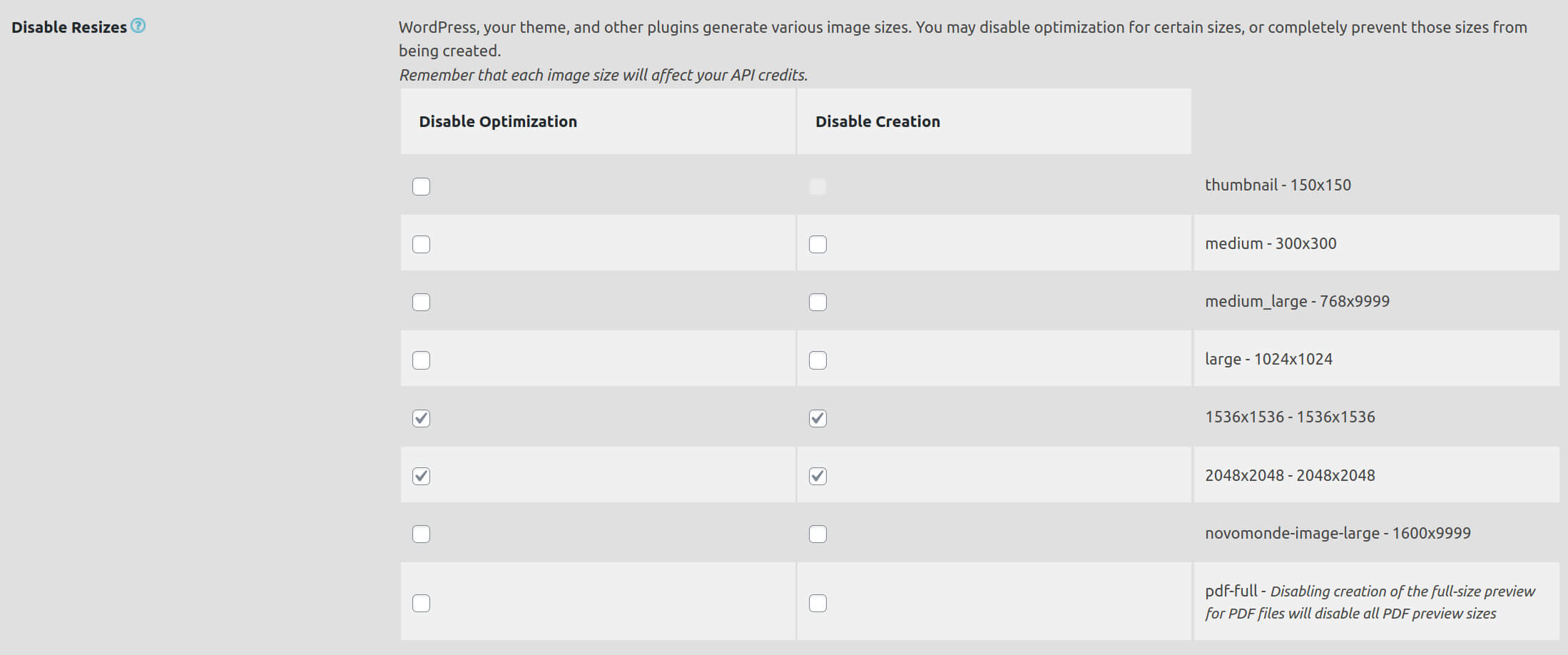

the EWWW image optimizer menu which controls the creation of different image sizes. Here I have disabled the creation of images in 1536pxs and 2048pxs wide - By default, the “srcset” and “sizes” attributes defined by WordPress are not ideal (it is more of a lesser evil). To load optimal images depending on the type and width of the screen, you should ideally customize these attributes. It’s a bit complicated, but I’ve explained it in detail in this article.
- If you are for example a photographer and you display images in a higher resolution than 2560pxs, you need to disable this limit (more about this a bit lower) . But if you don’t like to get your hands dirty, this plugin allows you to disable the limit.
For developers and advanced users
Honestly, I was surprised by the lack of communication around this important image handling update. As a theme developer, I had already set up image sizes adapted to the behavior of my images on different types of devices (responsive). As a result, I found myself overnight with a maximum size of 2560pxs and 2 new image sizes that were completely useless to me. This update potentially affects all developers who will have to make changes to their themes to adapt the maximum size threshold (the 2560pxs) or to disable the creation of some image sizes.
Below you will find all the useful functions and filters that will allow you to change these settings after the Update to WordPress 5.3
Functions et filters to modify images behaviour under WordPress 5.3
Modify or remove the max threshold
A new filter has been introduced in wordpress 5.3 to allow to modify or disable this maximum threshold of 2560pxs.
- to modify the threshold (let’s set it to 3200pxs for example), you can add this in your functions.php file:
add_filter( 'big_image_size_threshold', 'modify_big_image_size_threshold', 10, 4 ); function modify_big_image_size_threshold( $threshold, $imagesize, $file, $attachment_id ) { return 3200; } - to completely disable the maximum threshold (I did this on my themes), you can add this:
add_filter( 'big_image_size_threshold', '__return_false' );
This line will prevent the creation of the full-scaled.jpg image but will not prevent the creation of 1536pxs and 2048pxs wide images.
Disable image sizes you don’t need
To give you an example, for our travel blog novo-monde.com‘s theme, I had already added an intermediate image size 1600pxs wide and a maximum size of 3200pxs which worked very well for me. So, in addition to disabling the maximum threshold, I also had to disable the creation of intermediate images (1536pxs and 2048pxs) that were more or less redundant with my 1600pxs wide image. For this there are several solutions:
- Either you use the EWWW image optimizer plugin which allows you to easily disable the creation of some image sizes.
- Either you can use the following code snippets to see the image sizes active on your site and disable them if necessary:
- To get information about the sizes of the active images on your site (in addition to the default thumbnail, medium, medium-large and large sizes), you can add the following code:
add_action( 'admin_init', 'theme_additional_images' );
function theme_additional_images() {
    global $_wp_additional_image_sizes;
    echo '<pre>' . print_r($_wp_additional_image_sizes) . '</pre>';
}
You should see something like this appear at the top of your WordPress admin (and certainly other image sizes created by your theme):
Array ( [1536x1536] => Array ( [width] => 1536 [height] => 1536 [crop] => ) [2048x2048] => Array ( [width] => 2048 [height] => 2048 [crop] => ) ) - To disable all image sizes that you don’t need, you can use the following code:
add_action('init', 'remove_extra_image_sizes');
function remove_extra_image_sizes() {
    $sizes = array('thumbnail', 'medium', 'medium_large', 'large', '1536x1536');
    foreach ( get_intermediate_image_sizes() as $size ) {
        if ( !in_array( $size, $sizes ) ) {
            remove_image_size( $size );
        }
    }
}
For example in this case we will prevent the creation of the 2048×2048 image size as well as all other sizes potentially created by your theme or other plugins. So in concrete terms you just need to get the info on the image sizes with the 1st function and then use the 2nd one to keep only the sizes you want by modifying this line:
$sizes = array('thumbnail', 'medium', 'medium_large', 'large', '1536x1536');
- To get information about the sizes of the active images on your site (in addition to the default thumbnail, medium, medium-large and large sizes), you can add the following code:
Integrate the largest image sizes in the srcset attribute
By default, WordPress does not embed images that are larger than 2048pxs in the srcset attribute of the image tag. This limit has been included to prevent themes that implement srcset and size attributes incorrectly from loading images that are too large. But if like me, you’ve implemented these attributes in your theme, you’ll want all image sizes to appear in your srcset attribute. To do this, just use the following code snippet:
add_filter( 'max_srcset_image_width', 'remove_max_srcset_image_width' );
function remove_max_srcset_image_width( $max_width ) {
    return false;
}
I hope this article will be useful because I really included all the information I would have liked to have when I updated my WordPress sites to version 5.3 and following. In my next article, I will create a complete guide about the EWWW image optimizer plugin that allows any user (not only developers) to fix almost all problems related to images on a WordPress site.
- The official announcement of WordPress about big image handling
- WordPress official details about all the image processing changes in wp 5.3
Note: This article contains affiliate links towards the EWWW image optimizer plugin that I highly recommend to all WP users (I use it on all my sites). If you subscribe to the premium version using one of my links, I will get a small commission and you won’t pay anything more. This way, you will support us in creating this kind of free and independent blog posts.

Thanks a lot for the article, I was curious about the 2048 px parameter in media settings!
It is strange why there are no simple settings for disabling to images sizes in the wordpress admin?
The 1536 and 2048 size are not even shown in the settings->media menu.
I do not understand why the wordpress team forces user to have those image sizes?
Well I think the way WordPress handle images is quite good and it’s necessary to have different sizes for the sizes and srcset attr to work properly… The fact that there is no settings in the admin to disable some sizes is arguable. But there are plugins allowing you to do that easily (ewww).
Great article, thanks!
What I’d like to know how to do is how to have an alternate sizes attribute for template parts.
For example, if I’ve got a ‘featured blog post’ on the home page, and it’s pulling in the featured image, it’s going to behave differently at different breakpoints.
It’s in a container, so it never goes above 1/3 of 1140px. But then it goes to 1/2 of 992px and eventually 100% below 600px.
Everything I’ve read deals with filters that act more globally, but those sizes at the lower end of the spectrum are perfect for this use-case; it’s just that the sizes attribute is still something like 1920px, 100vw – meaning I’m loading the largest possible size for one of the smallest elements on the screen.
I’d be interested to hear your thoughts!
Hi Kelsey,
Well you have 2 solutions to deal with your problem:
– Either you use some filters to modify the sizes attribute according to your needs (an exemple here –> https://via.studio/journal/optimizing-your-theme-for-wordpress-4-4s-responsive-images)
– Or you use a service like EWWW (or shortpixel or optimole etc…) that can integrate an image CDN delivering the image directly at the right size for your user without you modifying the img markup
Great article, I was developing a theme for myself and was stuck in the additional image 1536 and 2048 sizes. After hours of findings, I came to know that those sizes are being used in dashboard section when we are looking or searching for images.
So, I personally do not recommend disabling or removing those sizes, instead use it as some default size in theme itself. This will definitely improve the storage space on the server.