
Producing good content on your website and blog is essential for a company or blog. Overall, we distinguish 5 sources of traffic for a website:
- Natural search (SEO)
- Paid search (SEM)
- Newsletter
- Direct traffic and referral
- Social Medias
Over the months we will discuss all these different channels on the blog, but for today we have decided to focus on the last one: social networks!
To get a lot of traffic from social networks there are 2 factors to consider: the size of your community and the conversion rate.
In this article we will therefore start by addressing the subject of the form of your shares on the different social networks.
There are different plugins that allow you to customize your sharing information. Easy Social Share or Yoast are good examples, but we will come back to the best choice to make in a future article.
One of the important components for the click rate of a publication on social networks is the image! At the moment people have news feeds that are overwhelmed with information it is essential to stand out a little bit from the crowd and it is therefore really important to take care of the presentation.
Sharing Images size on social media: the guide
When it comes to sharing content on social medias, one would quickly be tempted to choose an image and use it for all these networks. So certainly this method is effective in terms of time, but believe me, rushing the publication of an article in this way is clearly equivalent to missing out on engagement.
Indeed, each social network has its own specificities both in terms of the tone to be set for its publication and in terms of the optimal size of images. DepLES TAILLES D’IMAGES POUR LES RÉSEAUX SOCIAUXending on your audience, you may not necessarily need to create images for ALL social medias, but we strongly recommend that you define optimized images for all networks that are relevant to you and on which you are present.
A brief overview of the good practices to be adopted.
Facebook sharing: optimal image size
Image size for profile pages
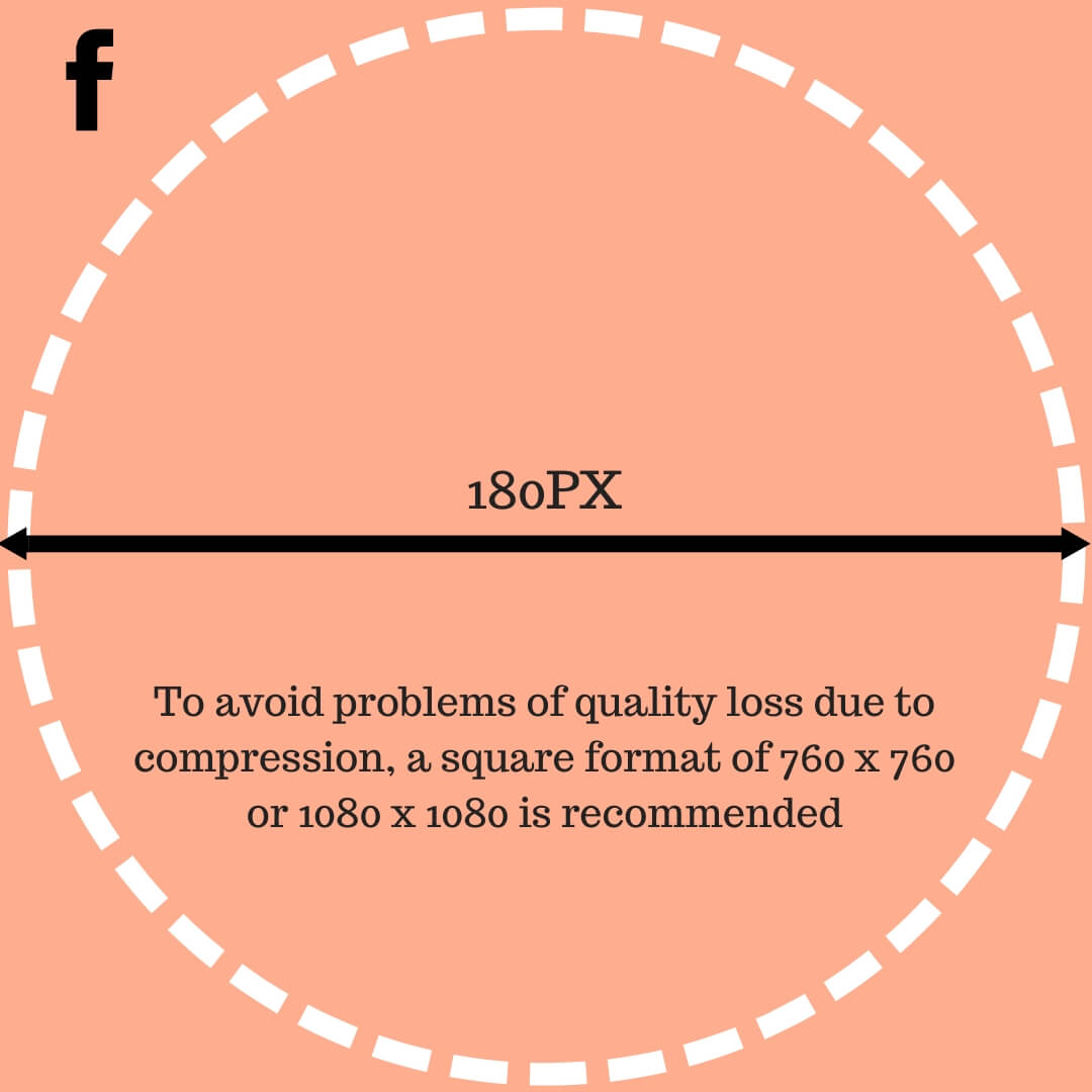
On your page the first element to set up is the profile photo. The latter is square and is displayed in 170 x 170 pixels on desktop and e 128 x 128 on mobile. Facebook requires you to upload a photo that is at least 180px wide and high.
Nevertheless, in order to avoid compression problems that could cause your image to appear pixelized (especially on retina screens) it is recommended that you always use a much larger image (but one that respects the proportions). A format of 760 x 760 or 1080 x 1080 is generally optimal.
In addition, note that in terms of quality it is better to upload a png file than a jpg file.
Attention! For your profile image, remember to choose a well centered image, because when you post something or leave a comment your image will appear in a small dot that is round and not square. Also, be sure to choose a logo that remains clearly visible and recognizable when displayed in a very small size.
Facebook: cover image for pages
For the cover image of your page the displayed dimensions are 851 x 315 pixels on desktop and 640 x 360 on mobile.
Here again it is recommended to upload a larger image that respects the ratio of 2.7:1
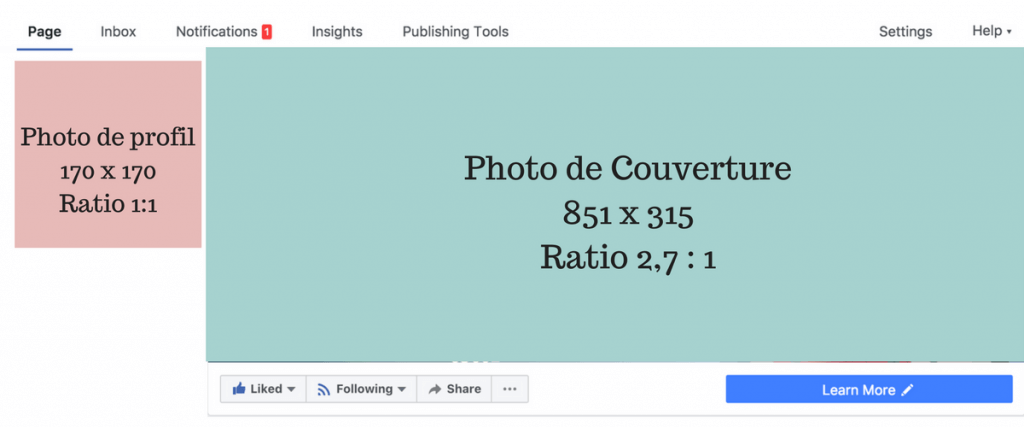
Image size for facebook article share
When you share an external url (it can be a page from your blog or a blog post) then Facebook will automatically generate a preview. Depending on the image you have defined in the metadata of your articles, this image will be larger or smaller. For a better rendering we recommend that you make sure you have the open graph metadata.
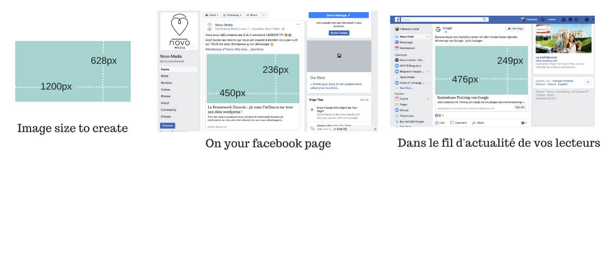
At the image level the ideal size for sharing an item is 1200 x 628px (or any larger image maintaining the 1.9:1 ratio).
This image will then be used by Facebook to be shared 450 x 236 pixels on your page and 476 x 249 on your readers’ news feed.
Picture sharing on facebook: what are the dimensions for the previews?
When you share images on your page, they are automatically displayed as an album. To have a more visual aspect on your page it is important to take care of the order and presentation of these images (especially those that are highlighted in the thumbnails on the page).
A small example from the Facebook page of our Novo-monde travel blog.
Example 1: Album share with 4+ pictures
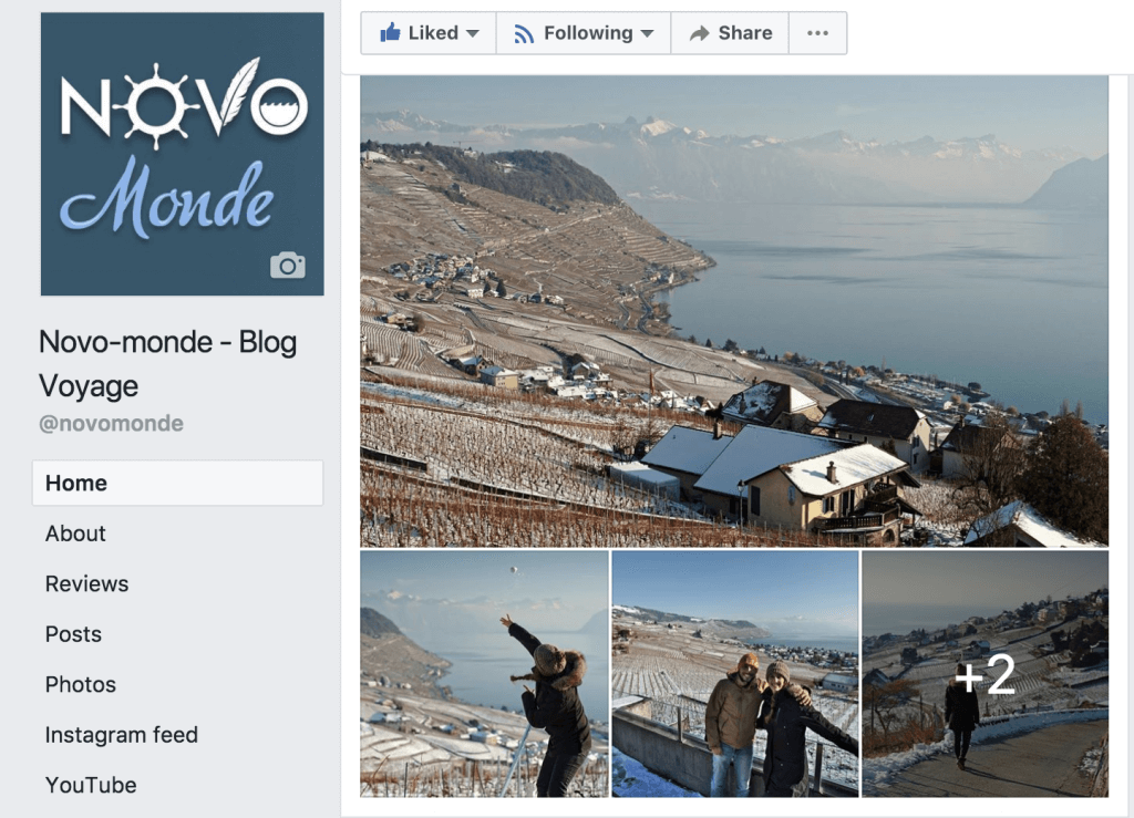
In this example you notice that the main image is a landscape image that lends itself well to “wide” viewing. The following 3 images are also in landscape format and are photos of us. Putting them in this order allows for a certain balance in the publication. All images are well centered and highlighted. The last image is slightly greyed out and indicates to the reader that there are other pictures in this album to discover.
The order of the photos can easily be changed in the Facebook editor at the time of upload.
Example 2: 3 pictures sharing
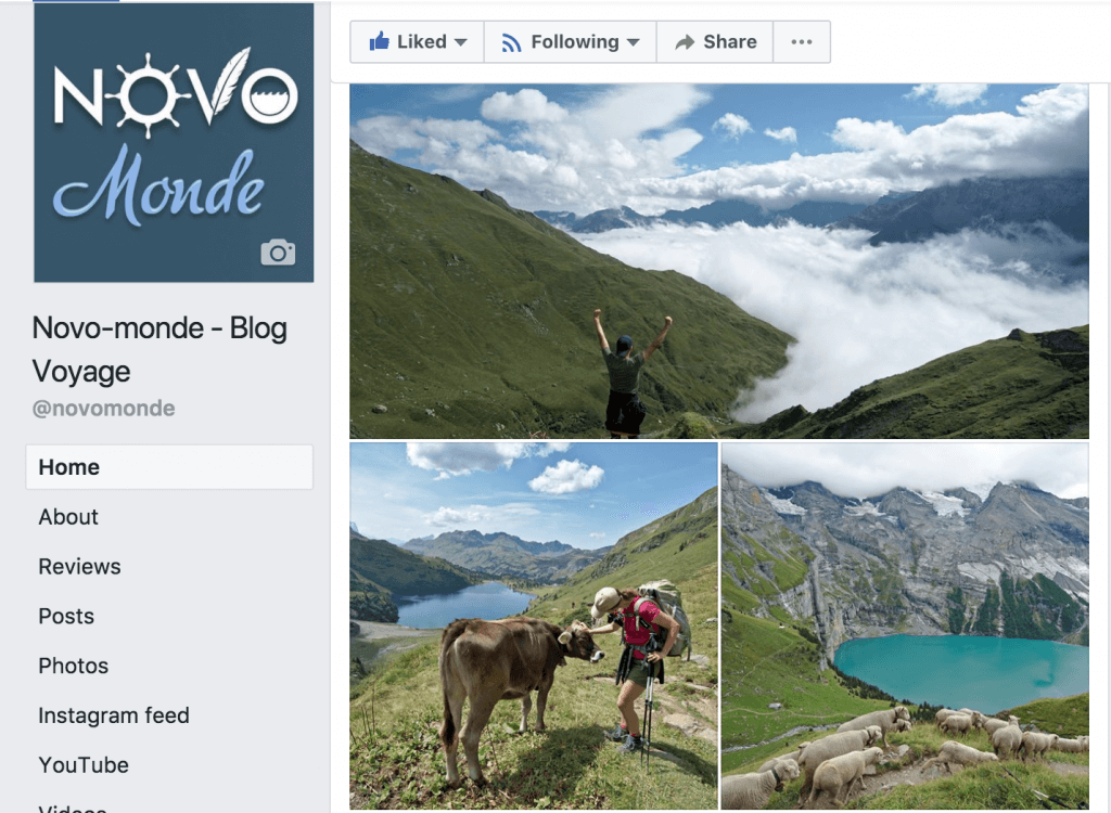 These 3 pictures were taken during our Via Alpina hike. Here we shared only 3 images and therefore the layout is different on the page. The order in which we placed the images is not by chance. At the beginning we would have liked to put the picture of Lake Oeschinen first. The problem is that this image presents interesting elements both at the top and bottom of the image (cliffs and sheep). The first image of the preview being displayed in a “banner” format, it was like cutting the cliffs and sheep and therefore the preview would only show the lake, which would probably have generated less engagement. Same for the photo of the cow, if we had put her first she would have had her legs cut off.
Image Size guide for photo sharing on Facebook
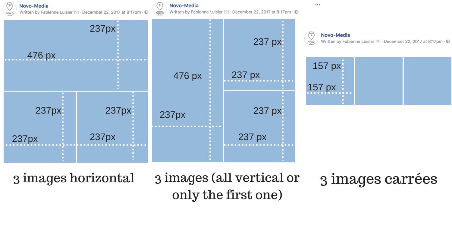
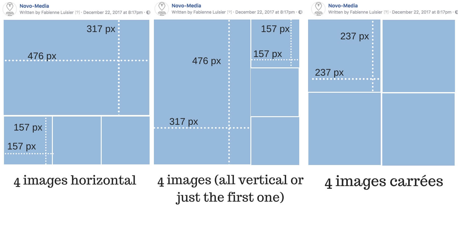
On Facebook there is one number to remember in terms of size and it is 476px. This is the width at which facebook displays your publications in the news feed and photo albums are no exception to the rule. In terms of height, the maximum is 716px for a photo box.
In this series of dimensions I give you the dimensions displayed by Facebook. Personally I recommend that you always upload larger images that respect the same ratio, this will allow you to have an optimal image quality on all types of screens.
Single photo sharing:
Pour une photo elle sera affichée en 476px de large avec la hauteur qui s’ajuste en proportion (la hauteur maximale est de 716px donc pensez y si vous partager une image au format portrait).
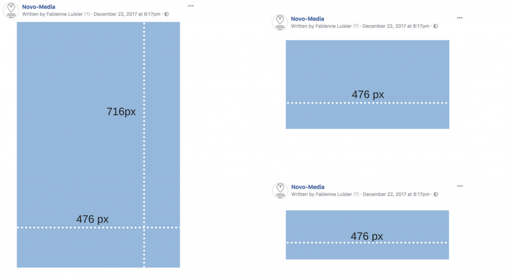
2 photos sharing:
If you share 2 images then the same logic always applies: the images are displayed 476 px wide (you have to remove 2 px separation between the images if side by side). In concrete terms, this gives this:
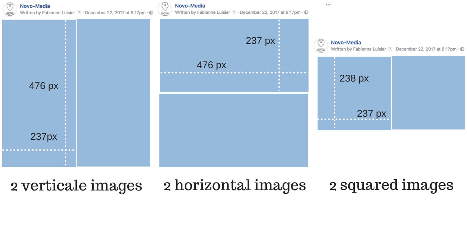
NB: You may want to share a horizontal AND a vertical photo. In this case know that the layout will take the form of the first image you put in the uploader. If you place the vertical image first then the 2 images will be displayed in 476px high and 237 wide while if you put the horizontal image first the images will be displayed one under the other.
3 photos sharing:
With 3 images the logic remains similar. In the case where the images are a mix between horizontal and vertical it is again the image that will be put first in the facebook upload tool that will determine the final layout.
4 photos sharing:
Share more than 4 pictures:
When you add more than 4 photos then it will automatically be displayed as an album where your readers will see the first 4 images of the album respecting the logic applied above. The only difference is that now the reader has an indication that more images are in the gallery thanks to a small overlay on the last image indicating the number of additional photos.
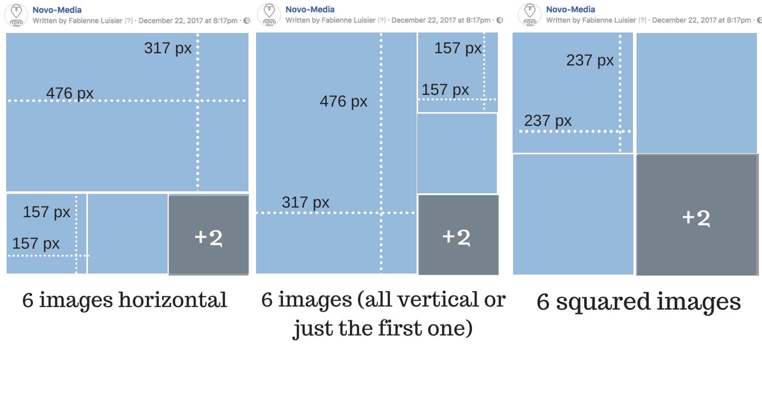
Image cover for facebook videos
If you add a video on Facebook, it will automatically be in the right format. However, one thing that may be interesting is to replace the default video cover image with a custom image containing, for example, the video title.
Indeed, during the upload, Facebook will offer you a choice of some static images extracted from the video as a cover. It is generally recommended to manually add a cover that will be more meaningful and engage people more.
The ideal size for this image is 1200 x 720 pixels.
Attention! If you put text on your cover image, make sure that the text does not take up more than 20% of the space. Facebook tends to penalize videos with a text to image coverage that is too high! Source
Twitter: The right images dimensions
The Twitter card for url sharing

When you share a link on Twitter and the twitter:card markers are in place in the source code of your site then the articles are shared with a nice preview. The image size to add to your article is ideally 1012 x 508 (ratio close to 2:1). But very often the image you defined for Facebook in 1200 x 628 goes very well here too, so it is not necessarily necessary to create a new one.
We will come back in a future article on wordpress plugins that will allow you to easily adjust the sharing text on your Twitter Card.
Other important sizes for twitter
Other sizes that may be important for Twitter are the profile image and the cover image.
The profile image is displayed in round format (with a diameter of 200px). However, you must upload a square image. A good format is at least 400 x 400 pixels to ensure good image quality.
Be careful to take into account that your image must be well centered because the 4 corners will “fall” to form the circle.
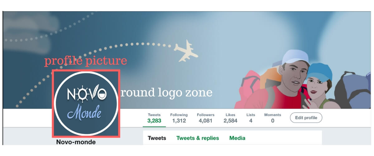
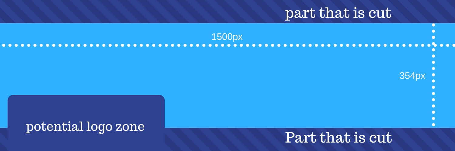
For the cover image it is necessary to add an image of 1500 x 500 px (ratio 3:1). Be careful to take into account that the logo overlaps the cover image and that only 354 pixels in height are visible on the 500 (the rest is cut off).
At the logo level its position is not fixed and will depend greatly on the resolution of the screen on which the page is loaded. This means that on low-resolution screens the logo will be in the left corner of the cover image, while on higher-resolution screens it will be slightly offset to the right as in the screenshot above of our Novo-monde account.
When creating your image, make sure you leave a large enough area in the lower left corner where you should not put any important details of your cover image. To help you, here is a small schematic representation:
Instagram: Do images have to be squarred?
Instagram was originally known for its square image format. The minimum ideal size for uploading an image is 1080 x 1080.
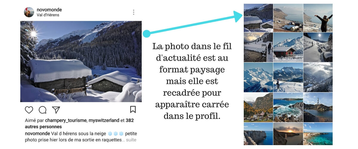
However, it has been possible for some time now to publish images in landscape format as well. In our opinion, the easiest way is to always add the image as it is and then crop it directly into the application in the Instagram upload tool.
Some images simply look better in landscape format than in square and therefore it would be a shame to do without them. However, what you need to know is that your “landscape” image will appear correctly in the news feed of the people who follow you, but a square thumbnail will still be generated to be placed in your profile.
Pinterest: What sizes for your pins?
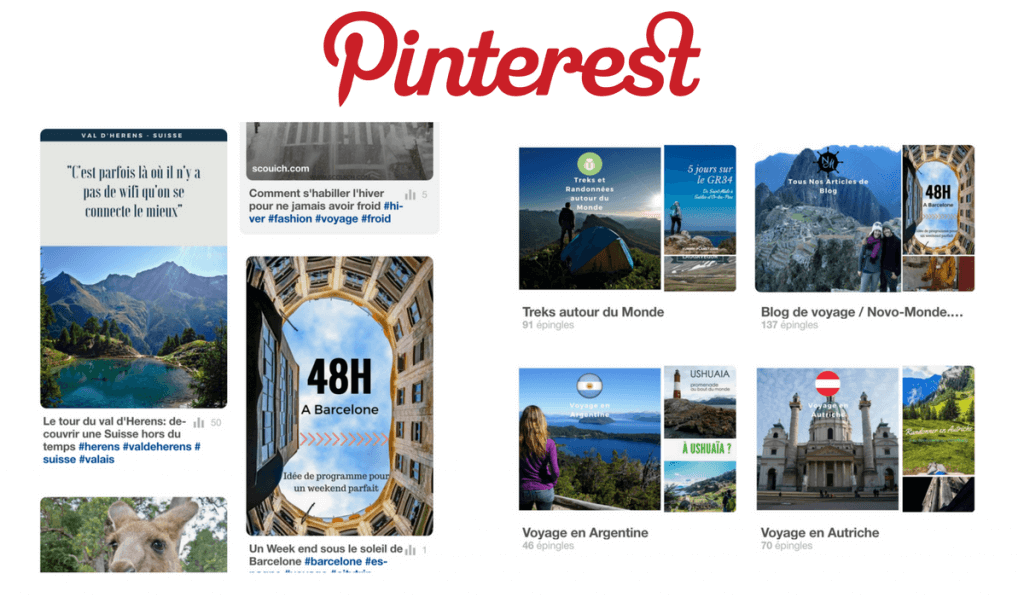
On Pinterest the size of the pins is not strictly defined. The only thing that is fixed is the displayed width of 735 pixels. In terms of height, we are free to choose, but it is important to know that by putting a pin too high, we take the risk that it will be cut.
An often described pin size is 735 x 1102 pixels.
The only exception is for pins that are intended to be used as a picture cover image. It is better to use square images here. Personally I usually opt for Instagram’s standard format of 1080 x 1080 pixels, which is also very well suited to Pinterest.
We hope you enjoyed this practical article! Feel free to save it in your favorites to quickly access it and share it with others.
And if you are on Pinterest, don’t hesitate to pin the image below to find it quickly. 🙂
We will try to keep this article up to date as changes occur on the different networks. Feel free to let us know if you notice that a network has made any changes and we have not yet updated them in this article.

Hello Fabienne,
Thank you ever so much for the Social media design sheet. Great up-to-date social media tips. Thanks for sharing.
Before knowing about the actual sizes, it’s really important to be familiar with different image formats that are used by the photographers and users as well. You give clear instructions indeed!